28 April 2010

Kent Bridges: 3. Whatman's Field Downstream Bridge


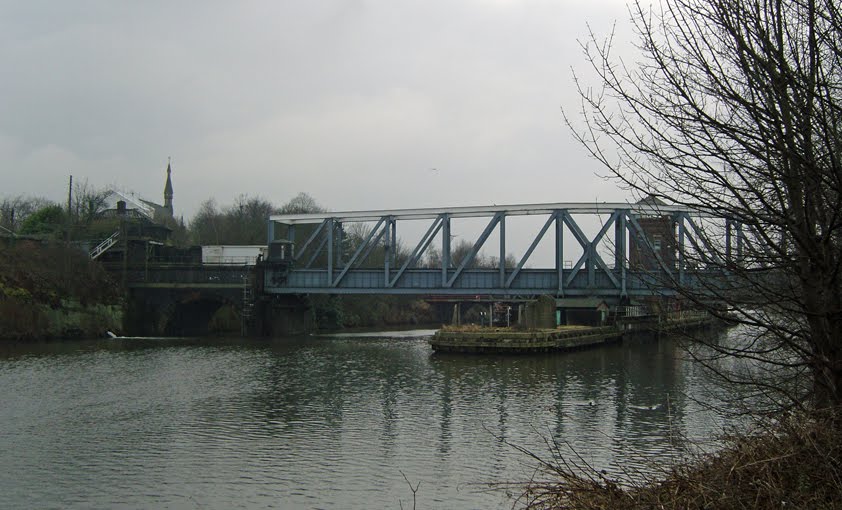
The last of the trio of millennial footbridges in Maidstone goes by the somewhat cumbersome name of the Whatman's Field Downstream Bridge, so called simply because it is further downstream on the River Medway than the Kent Messenger Millennium Bridge.

Like the Messenger bridge, the Downstream Bridge was built by Balfour Beatty (steelwork fabricated by Fairfield Mabey), and designed by Flint and Neill with Studio Bednarski. It also opened in July 2001, but it's a very different bridge.

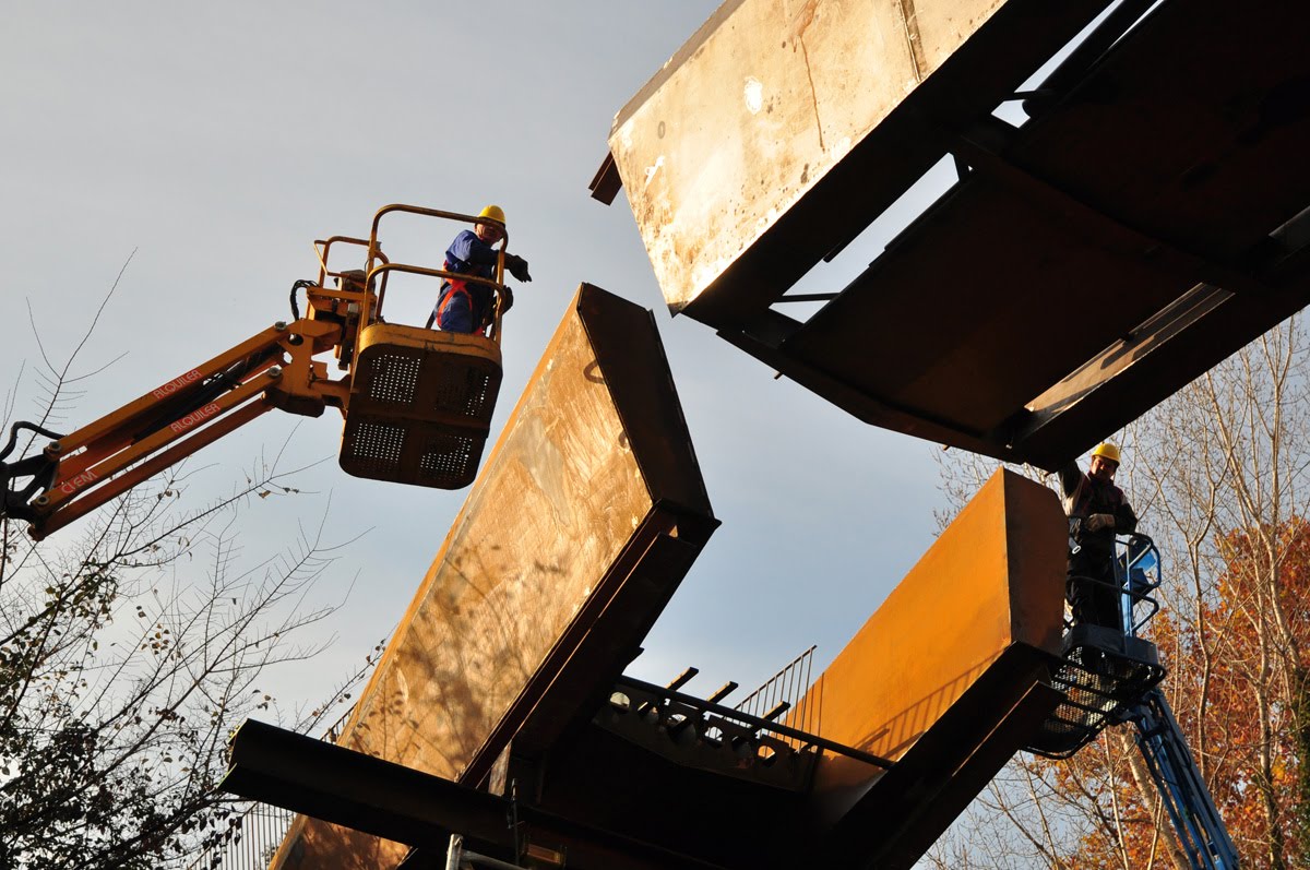
On Bednarski's website, it's called the "Blue Art Beam Bridge", and that seems apposite. It consists of a three-span, 75m long single steel box girder, in a very unusual "top hat", "spine beam", or "finback" arrangement. The river could only be closed for 4 hours for the main span lift. In most box girder bridges, the wider flange is at the top, to allow the full width of bridge deck to be carried while allowing the main structural section to be narrower and hence more economic (as well as visually appealing).

There are a few cases where the box girder has been inverted, with a recent example being Gifford's Central Park bridge in Manchester (illustrated in Masterpieces: Bridge Architecture + Design and the subject of a technical paper). This allows the construction depth (i.e. depth from top of pavement or rails to underside of bridge) to be minimised while retaining the advantages of the box girder form, and is a rarely used alternative to a through-truss design. The major disadvantage is that such bridges are often bulky and ungainly in appearance.

So, for the Downstream Bridge to have the wider part of the box section at the bottom seems initially a perverse choice. But the reason may be apparent from the two photographs above. Only the bottom part of the cross-section is highlighted by painting it blue. The upper part is recessed behind the parapet mesh, and a mesh hides the detail from above as well. The intent is to make the bridge deck appear far thinner than it really is, and I think it works well.

The other prominent feature of the bridge deck design is the presence of numerous circular cut-outs in the girder's bottom flange. These are in part a response to the technical approval authority's refusal to accept a fully enclosed box girder (presumably on the grounds that it would be too shallow for internal inspection). They allow for inspection access to all parts of the girder, but are protected against unauthorised entry by the use of grilles. Clearly, they will have made the design more challenging, with the girder effectively having two bottom flanges connected by a series of lateral crossbeams, Vierendeel style, providing the required torsional stiffness.

The bridge certainly needs plenty of torsional stiffness, as its two V-shaped supports are aligned along the bridge centreline, providing no resistance to torsion at all. All the torsion in the bridge is resisted at the end abutments.

The supports are made from tapered tubes (presumably circular tubes welded to flat plates or fabricated boxes), supported by a simple stiffener detail. The choice of V-shaped piers on the bridge centreline is shared with Arup's Gatwick Air Bridge [PDF] and makes me feel a little queasy: the lack of wider supports at the intermediate piers just looks somehow wrong to me, as if the whole thing could topple in the wind.

The bridge parapets use the same stainless steel "Medway" mesh as on the Kent Millennium Messenger Bridge, and like that bridge, it results in a simple and minimalist line to the structure. The photo also shows the grille panels which hide the bottom flange (while unfortunately also trapping debris).

You can also see a slight kink in the vertical alignment, which is unfortunate. I wonder if it's a relic of the need to change the bridge height during the design period. This unhappy tale is told in detail in an audit report [PDF], commissioned to explain the substantial overspend on Maidstone's Millennium River Park project. This noted a £200k overspend on the bridges (relatively small beer), attributable to high tender costs, a major flood which occurred during construction, and the need to raise the planned bridge height by 1.5m in order to mollify river users unhappy with the effect on their navigation rights.

It's nice to see a bridge which is colourful, although blue is perhaps too often the choice on steel bridges. I think the attempt to make the deck look slender has been very successful, and the circular openings below deck help break up the mass of the bridge as well as being functional. As with the other Maidstone footbridges, it's an idiosyncractic design and not one likely to be repeated often elsewhere (if at all). Nonetheless, it's always good to see designers stepping into the unknown, and it's a worthy member of a very interesting trio.

Further information:

25 April 2010

Kent Bridges: 2. Kent Messenger Millennium Bridge


Walk north in Maidstone from Lockmeadow Footbridge along the river Medway, and you'll come to the first of the town's two other millennial footbridges. This pair provide entry across the River Medway into the Whatman Field Park, and are named the Kent Messenger Millennium Bridge and the Whatman Field Downstream Bridge. These other bridges were both designed and built by a single team, as part of the Millennium Commission funded development of Whatman Park, one of the main sections of Maidstone's Millennium Riverside Park. This post will cover the Kent Messenger bridge, with the Downstream bridge to follow later.

In a paper on the two bridges, their architect Cezary Bednarski notes that they were the only millennium bridges in Britain not to be the result of a design contest. I'm not convinced about that, but Maidstone Borough Council certainly got good value, with both bridges being interesting and innovative structures, and both going on to win awards.

At the time the bridges were designed, Bednarski was a director of Studio E Architects, although he started a new firm Studio Bednarski a few months after the Kent Messenger bridge opened in July 2001. His engineering partners for the design were Strasky, Husty and Partners, and Flint and Neill. The main contractor was Balfour Beatty.

I'm not sure what the Kent Messenger bridge cost: Structurae and fib's Guidelines for the design of footbridges both report a figure of £1.76m, which works out at about £5.6k per square metre of deck, but Bednarski's paper states the cost to have been £2.9k per square metre.

The bridge is a very unusual structural form - the world's first cranked stress ribbon bridge. Perhaps it's still the only one. A stress ribbon bridge is essentially a catenary structure which has been stiffened by prestressing against itself. Depending on the specific geometry, it can be thought of as a reverse arch, where the prestress provides a broadly uniform upwards force along the structure's length, locking the structure in place. I've covered one such structure here before, the Punt da Suransuns, in Switzerland.

The stress ribbon bridge's generally low load-bearing capacity, together with the sagging geometry, mean that it's a structural form generally limited to footbridges. Even so, it's rarely an optimal form. What is gained in material economy in the deck (Kent Messenger bridge's 3.1m wide deck is only 0.29m deep) is generally lost in the cost of massive foundations, and the foundations for the Kent Messenger bridge are massive indeed, as can be seen in a diagram at Strasky's website. The sagging geometry is also often hard to reconcile with the need to provide a gentle slope, suitable for access by the mobility-impaired. Keeping the slope shallow enough can result in very high horizontal forces, and still larger foundations.

So, what does "cranked" mean, and why is it so unusual? Essentially, it means that the bridge is kinked in plan. The Kent Messenger bridge is 101.5m long in total, with two spans of 37.5m and 49.5m respectively. At the central support, the deck changes direction in plan by 25°. To make that possible, a large horizontal restraint is called for, as the tension forces in the two spans don't balance.

The nearby Downstream bridge (which I'll cover in the last post in this short series) was also originally proposed as a cranked stressed ribbon, with the resultant force at the "crank" restrained by a tie. It was eventually built in a much different form, but the Kent Messenger bridge retained the crank, with the resultant force restrained by a strut. The strut is angled downwards according to the vector sum of horizontal and vertical reactions, and conveniently doubles as a staircase, a very effective solution.

Unfortunately, it doesn't quite work perfectly under all load cases, and a very slender stainless steel member had to be incorporated below the support position, acting in many cases as a tie to prevent the deck rising, and in some cases as a second strut. It could only have been omitted by providing the staircase with much enhanced bending capacity, but I think it's a shame it was included, as the bridge would be far more impressive without it.

The bridge deck itself consists of 3m long precast concrete segments composite with an in-situ infill deck slab. The segments are supported on a set of four bearing and four prestressing cables cast into the infill.

Drainage grilles are located along the centreline of the bridge (and can be seen on the image on the right), breaking up the structure's monolithic appearance and allowing the river to be seen through them. These alternate with lights embedded in the deck (see below left). These are the same kind of lights you would find on an airport taxiway, a rather idiosyncratic choice.

The bridge parapet incorporates a custom-designed stainless steel mesh, which is now marketed as the "Medway" mesh by Potter and Soar.

As with the Lockmeadow footbridge, the Kent Messenger Millennium Bridge wasn't shown to its best on a dull, overcast day. Given that stress ribbon bridges are often chosen for their lightweight, slender appearance, I was surprised to find this bridge offering an almost brutalist statement. The cranked geometry was clearly an attempt to push at the boundaries of structural design - there are several other forms which would have served as well, perhaps incorporating some of the length eastern approach ramp into the bridge structure. The staircase strut is a great design feature, although it's a shame about the presence of the central tie, as the bridge would have had a far more startling visual tension without it.

The overall geometry aside, it's a plain, functional, rather minimalist structure, and none the worse for any of that. Compared to the tangled cat's cradles of two of its contemporary Millennium Bridges (at Bankside and Hungerford), it deploys its structural ambition to a more self-effacing end. The views off the structure are kept free of cables and struts, and there's little more to see below. I can't say I found it at all an exciting bridge to visit, but I guess that's part of the intention, and it's good to see a strong design that doesn't take its lead from Calatrava.

Further information:

23 April 2010

Bridges news roundup

I've got a couple more Maidstone footbridges I want to post, and then a couple of interesting bridges in Scotland that I recently visited. While those gestate, here are a few other items gleaned from the web ...

DNA-inspired - World's first curved double helix bridge at Marina Bay
And probably the last.

Chances for a great Inner Belt Bridge design in Cleveland are looking slim
Cleveland journo wants what Cincinnati's having.

Pick your favorite Brent Spence Bridge
Meanwhile, Cincinnati's debating what bridge to have, although they can't afford it yet anyway. There are six options (by Rosales and Partners with Parsons Brinckerhoff) under consideration, and they plan to whittle it down to three in May.

Calgary audit delves into city’s purchasing decisions
Including whether it was right to appoint Santiago Calatrava on a CAN$3.3m contract with no competition.

24 of the world's most amazing bridges
Spot the factual errors.

13 April 2010

Kent Bridges: 1. Lockmeadow Footbridge


A recent trip to Kent, in southern England, gave me the opportunity for a short side-trip to the town of Maidstone. This is the home of no less than three modern landmark footbridges, all built around the turn of the millennium. They were promoted by Maidstone Borough Council, with external support from funders such as the Rochester Bridge Trust.

It wasn't the brightest of days, so none of the bridges were shown to their best effect. The first is Lockmeadow Footbridge, spanning the River Medway close to the 14th century Archbishop's Palace. This is a historically sensitive site, and it's apparent that the bridge designers, Flint and Neill with Chris Wilkinson Architects (now Wilkinson Eyre), sought to create as lightweight a structure as possible in an attempt to minimise its visual intrusion.

They won the bridge design contract following a design competition in 1997, and the bridge was opened in October 1999. It was built by Christiani & Nielsen for £650,000 (£3.9k per square metre of deck), with steelwork by D&B Darke Ltd.

The bridge is 80m long, with a 45m main span, but the deck is only 300mm deep. That gives a remarkably slender span-to-depth ratio of 150. The span arrangements are driven by the need not only to bridge the river, but also to clear the adjacent floodplain. The choice of a large central support was driven by construction constraints, with a weak river bank wall and limited access available on the east river bank. The resulting bridge deck is a little awkward, as in dry conditions it has a very low clearance underneath (see main photo at the top of this post). However, the overall structural form, with twin pylons each carrying twin cables, is very striking, particularly in elevation.

To achieve the desired deck slenderness while minimising weight, a cellular aluminium deck has been adopted. A series of extruded profiles, supplied by Dutch firm Nedal, are placed side by side, and locked together by transverse stainless steel prestressing bars at 1.6m intervals. A non-slip texture is obtained by sawcutting the upper surface of the extrusions. Ian Firth's paper in SEI (see link below) gives much more detail on how the deck was conceptualised, designed, and built. The aluminium segments still look in very good condition a decade after the bridge opened in October 1999. The main question that strikes me is why, if this system is so economic and durable, it hasn't received much wider use?

The use of cellular aluminium extrusions in bridge decks isn't unique, with patented systems such as those from Alumadeck and Sapa Front (see paper by Tomasz Siwowski [PDF] for details). But the arrangement used at Lockmeadow was highly innovative, and only one of several aspects of the bridge which are unusual.

The skeletal steel masts are a design which Chris Wilkinson Architects had already used for the entrance canopies to the Dyson Headquarters at Malmesbury (completed just a few months before the Lockmeadow bridge). They remind me a little of the Skylon, which was similarly cigar-shaped, but also evoke the stylings of high-tech architecture. The use of twin plates for each diaphragm is a nice feature.

The parapet posts are resin-filled, curved FRP forms, supporting stainless steel handrails and stainless steel mesh infill. These are surprisingly transparent, but still add to the visual depth of the structure.

The bridge seems to me to be most successful visually when viewed in elevation, where the unusual cable-stay arrangement is most effective. However, it's almost impossible to see the whole bridge from any viewpoint to the north or south. It therefore seems unnecessarily gigantic - the field of view struggles to contain its scale and it's therefore perhaps more domineering than was intended.

Viewed along the deck, the visual complexity of the pylons and cable arrangements again give the impression that bridge is larger than it really is. It seems to be trying a little too hard, grabbing attention rather than relinquishing it.

That was all something of a surprise to me, as having only seen photographs of the bridge before, I'd been very much looking forward to visiting it. Perhaps my expectations were too high; perhaps the overcast day would have made even a structure of filigree glass seem heavy and awkward rather than graceful.

Given the bridge's unusual slenderness, I did my best to get it moving under an oscillating pedestrian load, but without success. Tie-downs secure both ends of the bridge, and I guess these are balanced with the tension in the locked-coil cable stays to limit vertical movement of the deck.

As a piece of structural engineering, it's a tour de force, with a distinctive visual form, several innovative elements, and having been well-engineered to prevent its slenderness leading to vibration problems. Architecturally, I left it with mixed feelings. It's unexpectedly ostentatious, giving the distinct impression that it might work better in a different visual context. But I'd like to visit it again on a sunny summer day, as I suspect that would lead to a more positive appraisal.

Further information:

11 April 2010

Bridges news roundup

Okay, I'm just back from holiday, and it will be a few days before I get time to put together a proper post. So for now, just two quick items that you will probably have seen elsewhere anyway.

Arup / Grimshaw declared 4 Mile Run bridge competition winner
Website has PDFs with full details of the winner and the other two shortlisted design teams

Pennington Road Footbridge opens
Softroom & Eckersley O'Callaghan's RIBA competition winning timber bridge (see previous post)

08 April 2010

Can Gili Footbridge


I've been waiting for an opportunity to feature one of the bridges of Xavier Font Solà (of the design firm Alfa Polaris), and with his Can Gili Footbridge completed on site in January at Granollers, near Barcelona in Spain, that opportunity has arrived.

Alfa Polaris is perhaps best known for their multiple award-winning restoration of the Pont Trencat, a historic masonry arch bridge which had been partly destroyed in 1811. A new span was added in weathering steel, retaining the arch form, and achieving a unique blend of historically sympathetic restoration with brutalist modern intervention. I also very much admire their Joan Camps footbridge, also in Granollers, which again uses weathering steel and gives a very distinctive take on the traditional Warren truss design.

If rust orange-brown steel seems something of an Alfa Polaris signature (much as white paint is for Calatrava), then the €574k Can Gili footbridge will do nothing to dispel that impression. The bridge design commenced in 2001, but funding for construction was only secured in 2009. The structure was built by ACSA Obras e Infraestructuras, with steelwork by Talleres Plain.

The design's heavily asymmetric appearance is a direct response to the profile of the highway cutting that is bridged. This is also asymmetric, with an embankment much taller on one side than the other, and there is poorer ground to one side of the highway. This has led to the single offset V-shaped pier, although you could also see the bridge as arch-like in its form.

The bridge was erected with only four one-day road closures, which the designer notes was a key constraint leading to the adoption of a steel rather than concrete design. However, my own experience is that in the UK at least, it is exceptionally rare for a road to be closed for so long, and most footbridges over highways have to be installed within a single night-time closure. Four days is positively luxurious.

The bridge's main superstructure consists of two 40m long hollow weathering steel box girders, supporting a plastic lumber deck 2m wide (plastic lumber is a cheaper alternative to the fibre-reinforced plastic which is becoming more and more common as a bridge deck material). The main span is 33m.

There's absolutely nothing about the site which makes the design choices inevitable. Plenty of other structural forms could have bridged this divide, most without any need for an intermediate support within the highway cutting. The design seems positively willful, but the result is sufficiently striking to justify that.

I don't know how weathering steel will develop its characteristic protective patina over time in Spain, but the current orange colour looks spectacular against a blue sky. The dark purple colour it can take on later will have less character, but most of the bridge's visual impact is from its shape anyway.

The contrasting use of stainless steel handrails, infill bars, and approach rails looks good. The bridge uses low-level LED lighting for illumination, an increasingly common choice.

Do I like it? Very definitely. It's strong and bold, and shows that a form with almost brutal solidity can still make an attractive structure in the right context. That's in marked contrast to the trend for modern footbridges to be lightweight, almost to dematerialise in favour of ultra-slim decks and cable support networks.

Further information

06 April 2010

Manchester Bridges: 14. Newport Street Bridge (Bolton)


Okay, the end is near and it's time for this series of posts to face their final curtain. Looking back it seems amazing that I managed to visit so many bridges in a single day, especially since this last bridge isn't actually in Manchester at all, although it is still within the boundaries of Greater Manchester.

Newport Street Bridge is in the town of Bolton, a few miles north-west of Manchester. It brings my series of posts full circle, for reasons which will be obvious if you return to the first post, on the Hulme Arch Bridge (there's another similar structure at Gogarburn, in Edinburgh, for anyone wondering how widespread this bridge type is becoming).

The previous road-over-rail bridge at this site was assessed to have inadequate load capacity, and restricted to 7.5-tonne highway vehicles in May 2001. Several options were considered for its replacement, including a Warren truss design, and a half-through bridge with edge girders, but the favoured option was the steel parabolic arch which has now been built. Apparently, this was not just because it provided a gateway to the town centre and adjacent bus interchange, but also because it was the least expensive choice, which seems surprising.

The bridge cost £4.2m (some £0.9m more than originally budgeted, following a series of cost rises), and partially opened to traffic in December 2005. The main contractor was Galliford Try, with the 265 tonnes of steelwork fabricated by Watson Steel, a Bolton-based firm. The designer was Cass Hayward.

The bridge spans 35m, and the 1m diameter tubular arch is 17m tall. So it's roughly two-thirds the size of its cousin in Hulme. The choice of a tube rather than the trapezoidal section used in the Hulme Arch gives a much less refined, but not unattractive appearance.

The Newport Street Bridge also suffers in comparison as there are fewer viewpoints from which it can be appreciated. This matters because one of its key visual features is the way the cables are seen to cross each other differently from different perspectives. The Hulme Arch is frequently seen with its cables crossing, but the main view at Newport Street is the opposite. While it is a successful gateway arch, that's true only viewed along the street, as it's essentially invisible to users of the railway below.

The smaller span and consequent lack of height has also led to the use of much more pronounced outriggers than at Hulme. I guess this is needed to keep the cables sufficiently far from the highway that they aren't vulnerable to accidental impact. The outriggers then have to be braced in plan to resist the horizontal component of the cable forces. It looks a little fussy as a result, but it's not a major defect.

One thing I can't quite work out is how the arch thrusts are restrained. Visually, there are concrete plinths which suggest the arches are founded on ground (or connected to the bridge abutments), as was the case at Hulme. However, the online document discussing increases in bridge costs lists £17,000 for "dummy plinth to arch base ... included for aesthetic reasons", so perhaps it is less straightforward than it looks.

Overall, it's not a great bridge, but it appears to do its job as well as it can. As at Hulme, any hope it might actually inspire new development and regeneration seems to be scant, with the Bolton bridge sitting next door to grotty shops and an uninspiring townscape.

That's it for my series of reports from (Greater) Manchester. There were a few interesting bridges I didn't get time to visit, so hopefully I'll get a chance for a return visit some time.

Further information:

05 April 2010

Manchester Bridges: 13. Barton Swing Aqueduct


At last, the end is in sight. This post covers the penultimate bridge(s) I visited on my mini-tour of Greater Manchester, and it's the only one so far chosen for its historical significance rather than its modern design.

There are two swing bridges over the Manchester Ship Canal at Barton, a road bridge and an aqueduct. This post is titled after the aqueduct, because it's clearly the more unusual structure: how many moveable aqueducts are there, after all? (In the UK, the Falkirk Wheel and Anderton Boat Lift are the only others that come to mind, suggesting that Barton has the only swing aqueduct). Both structures are Listed Grade II*, which is a recognition of major heritage importance.

The Manchester Ship Canal follows the line of what was once the River Irwell. The river was originally bridged at this point in 1684 by a masonry arch bridge. This bridge was supplemented in 1761 by James Brindley's Barton Aqueduct, a three span stone arch bridge carrying the new Bridgewater Canal above the river. Both bridges were removed at the beginning of the 1890s to be replaced by the current swing bridge structures, which opened in 1893.

The swing bridges were designed by Edward Leader Williams, James Abernethy and William Henry Hunter, with the steel structure built by Andrew Handyside and the opening machinery by Armstrong Mitchell & Co. Williams had already completed the Anderton Boat Lift, and determined that the aqueduct could be constructed as an extended water tank, sealed at the ends prior to rotation, and swung while full of water.

Both bridges are riveted mild steel top-braced truss structures, although the aqueduct is largely the same height along its length, while the road bridge has a tapered profile with a more obviously curved top chord.

The aqueduct is 71.5m long (Wikipedia has incorrect details), and weighs about 650 tonnes, with a further 800 tonnes of water held in the deck trough. The road bridge is 59m long and weighs 660 tonnes. Both bridges are turned by hydraulic (water-powered) engines, and originally had "centre press" hydraulic jacks in the pivots intended to relieve pressure on the roller supports during operation, although these are no longer used.

The water is retained when the bridge opens by swing gates at each end. In the closed position, a U-shaped rubber wedge is allowed to sink downwards into the gap between the bridge and the approach channel, providing a seal.

Neither bridge is in any way a beauty, but the aqueduct in particular is clearly of historic significance, and possibly unique. I didn't get to see them open, unfortunately.

Further information:

02 April 2010

Larvik bridge competition winners announced

Since 2005, the Norwegian Public Roads Administration has been planning improvements to the E18 highway near Larvik. They elected to hold a design competition for the most sensitive site, with four teams submitting entries at the beginning of February (entries judged anonymously). While this involved the design of a new highway bridge structure, the development of landscaping proposals was also a key element.

Two winners were declared on 26th March, one for the bridge, and one for the landscaping, with the recommendation that their proposals be combined. I've included images below, click on each one for a larger version.

The detailed competition jury report is available online, as are the design submissions from each entrant.

Winner (bridge)
Ramboll / L2 arkitekter

Winner (landscape)
Aas Jakobsen / Plan Arkitekter / Grindaker / Geovita / ViaNova Plan

Also competing
Cowi / Flint & Neill Limited / Knight Architects / Løvlien Georåd AS

Also competing
Møller & Grønborg arkitekter / Niras

01 April 2010

Critic critiqued

Regular readers will know that the design of a new landmark bridge across the River Wear in Sunderland has a been a topic I've returned to on many occasions. Generally, I've been pretty critical of the entire enterprise, which involves hanging a 336m long bridge deck off two giant prestressed tusks.


The designer, Techniker, has mentioned me in passing as part of a lecture to graduates in Newcastle, available on their own blog. Amongst lots of interesting material on the evolution of their design, they have this to say:

"I have really enjoyed following the blog of the Happy Pontist, a self-appointed critic of bridge design. He is a bit sad but the point is he is genuinely aggrieved. He is not the only one to use their technical authority to say this couldn’t be built then when the figures were out move to the position of it shouldn’t be built then when the cost-benefits come back set up a rear-guard action that it’s just plain ugly. For structures that are permanent, that will effectively be there for all to see forever, across all booms and recessions what is the proper thing to build?"
I'm happy to be "self-appointed", and indeed would hope that no formal license is required simply to go online and post the same views I'd happily share with people in person. I'd also note that I've never called the bridge "ugly" (I have, indeed, called it "amazingly beautiful"), nor suggested it is unbuildable.

But set these aside, because the substantive point at issue here is the final sentence, and the question "what is the proper thing to build?"

The Techniker design is structurally, and hence economically, extravagant, in the service of an essentially architectural vision. Pylons without back-stays (or with "virtual backstays", as Techniker would describe it) do not follow from any purely structural response to the logic of the bridging problem. Here's what Techniker's Matthew Wells had to say on structurally extravagant design back in March 2006 [sorry, that link may only be available to NCE subscribers]:
"'Following the Calatrava route isn't necessarily the best option. Iconic structures don't have to be overweight or over engineered. I believe there is a moral duty not to waste money on infrastructure projects. Efficient structures that give value for money don't have to be dull."
He also identified the demand for such structures to act as beacons for investment in economic regeneration. Discussing the Gateshead Millennium Bridge, Wells went on: "The contribution it's made to the image of the area and the inward investment it's attracted are priceless. That's what clients are looking for, the so-called Bilbao effect - the same impact as the Guggenheim museum had there."

So on the one hand there may be a "moral duty" not to follow (let alone out-do) Calatrava-style flamboyance, and instead to promote efficiency and value for money. On the other, there's the desire to create spectacular icons signposting urban revitalisation. The tension between the two is at the heart of any disagreement on whether, in engineering terms, the River Wear bridge is a "good" design, and at the heart of many a discussion on "iconic" bridges.

The conventional engineering point of view is straightforward, and was aptly summarised by Woodruff and Billington in their review of Calatrava's costly Sundial Bridge: "the drive for landmark bridges has led some engineers to disregard the engineering ethic of economy with some recent footbridges". I've covered this sort of philosophy before, as it has been espoused by most bridge engineers writing on aesthetics: Menn, Leonhardt, Virlogeux and others. As I noted when discussing Woodruff and Billington, value should be more than just a monetary concern, and hence an obsession with economy unfortunately tends to reduce value to a matter of bean-counting. While engineers instinctively like anything that is measurable, there is more to life than a conventional cost-benefit analysis can capture. What price joie de vivre?

Clearly, the River Wear design could be considered visionary, innovative, monumental, even inspiring in its ambition. It puts the "icon" in "iconoclastic". It will have a value both for the spirit of the neighbourhood and for whatever investment in regeneration it can trigger. The question for me is not whether it meets these goals, but whether a different design could also have met them, and whether such a design could be more structurally efficient, and hence offer the taxpayers a better balance between value and cost overall.

I don't see how else you can balance the scales of cost and value other than by comparing a number of alternative options, and I find it hard to believe that in this instance, a more efficient design wouldn't have delivered substantial value for significantly less cost. I think my difficulty with the Wear design also comes down to a bridge engineer's basic instinct: there are other "iconic" bridges which are notable for their extravagance (e.g. the Gateshead Millennium Bridge, one of the most expensive footbridges ever built, for its size), but which have a more conventional structural logic.

Perhaps only posterity will tell whether the Sunderland bridge is destined to be regarded as an engineering marvel along the lines of Eiffel's tower (much criticised when it was first proposed), or simply the bridge world's equivalent of an architectural folly.