Since then, I've been waiting for the RIAI to publish the other competition entries (as they said they would), but there's still no official sign of them. So, while we wait, here at least are the top five designs, the ones that made the final shortlist (they've already appeared at architecturenow, but I've added a few pictures they didn't have, as well as some of the non-shortlisted entries).
As always, links are only given if there's more information on a firm's own website, and you can click on any image to bring up the full-size version.
Alan Baxter / Aedas


This struck me as a reasonably straightforward and appealing design, so far as can be discerned from the limited images available. The structure's tilted legs owe something to the Castleford Footbridge (also designed by Alan Baxter), although here and at this angle, temporary propping would be required during construction, which would have some adverse impact on the valley floor.
The pedestrian walkway is brought close to the water rather than stuck distantly up in the air. The appeal is obvious. I guess the jury disliked the intrusion in the valley, but I think it's a reasonably elegant solution.
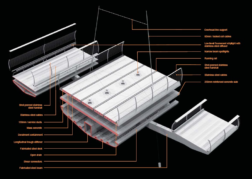
Arup / Heneghan Peng Architects


The jury's opinion was that this bridge was geometrically complex and hence likely to be expensive. It's easy to see that it's complex from the images, with the twin main box girders deforming in a way that would be very difficult to build, and the secondary footbridge even more twisty-turny in its arrangement.
It just seems somehow a bit unnecessary, trying a bit too hard to be different for no real reason.
Buro Happold / Explorations Architecture
I've discussed this one already, so won't repeat it again other than to note that more pictures and a thorough descriptive text can be found online courtesy of Dezeen and Europaconcorsi.
Flint and Neill / Foster and Partners


The competition jury took the view that this design was visually too tall and dominant, and I find it hard to argue with that.
Clearly, a lot of thought has gone into the design, including the development of a tilt-down construction sequence to minimise environmental impact in the valley (at the cost of requiring expensive temporary towers and cable supports). But the deck looks very thick away from the main arch span, and that gold colour ... ick!
Scott Wilson Scotland Ltd. / B+M Architecture


What is it with the gold colour?
I like the old-fashioned steel truss design for the deck on this entry, it's nice to see a bit of texture amidst the sleek minimalism of some of the other designs.
But what on earth were they thinking when they came up with those towers?
Not shortlisted
Not shortlisted
There were, I believe, another 18 entries that didn't make the shortlist. I've only found two online so far, but will add others if I locate them.


Update 8th December:
I've received images of one more of the entries, shown below. These again raise the question of whether height was or was not appropriate in this setting: the competition jury didn't think it was, but it's important to recognise that the amount of tree cover present in the valley limits the visual dominance of even a single-pylon cable-stay solution. As one of the Knight images also makes clear, height also allows the presence of the new Metro West light rail route to be signposted from further away.
Knight Architects / Arup


Update 15 February 2011:
I found another entry, shown below, and a load of new images for the Heneghan Peng design, some of which I've added above in the appropriate place:
Mott MacDonald / Architecture et Ouvrages d'Art


No comments:
Post a Comment