The entries are submitted and judged anonymously, and have all been given odd Latin names for ease of identification. There was a list of ten entrants in my previous post, I don't know why there are eleven entries on display. Here's that list again:
- WSP Finland / Knight Architects
- Arup / UNStudio
- Carlos Fernández Casado
- Pontek Oy
- Knippers Helbig / Zwarts and Jansma
- Apia XXI / Batlle and Roig
- Schüssler-Plan Ingenieurgesellschaft / Dietmar Feichtinger Architectes
- Setec TPI / RFR
- Roughan O'Donovan / Michel Virlogeux / Dumetier Design
- Arup / Amanda Levete Architects
Ventus
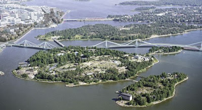
With its series of repeated cantilever / stayed steel modules, this bridge reminds me of Riccardo Morandi's Lake Maracaibo bridge. That concept belongs to a long-dead period of stayed-bridge design, overtaken by methods involving larger cable arrays which are cheaper to erect. The position of the steel stays doesn't appear structurally rational - the obvious point to connect to the deck is at the third-span points, not near the centre. Visually, it is highly distinctive, and not so tall as to be overbearing.
Nexu
The Nexu design is the more conventional version of the first proposal, with a single row of pylons in the centre of the deck and a conventional central band of cable-stays carrying the deck. Its sense of discretion appeals to me, it appears to be trying to fit into the landscape rather than distract from it. Viewing the video, you can see two cycle/footways, one on each side of the central tramway. I don't think this is ideal for such a long bridge - users travelling on foot should all be able to mingle in one walkway area.
Debet Semper Plus Esse Virium In Vectores Quam In Onere
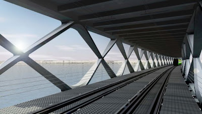
I think this is easily the most interesting entry, a hugely elongated covered bridge intended to provide shelter to users throughout the year. Pedestrians walk on a central raised platform, with tram tracks either side. A diamond-faceted shell provides the enclosure. It's hard to decide whether the lack of visibility and exposure to the landscape is a price worth paying for the provision of shelter. I'm unclear why the shelter needs to cover the tram tracks - it would be less expensive, and easier to maintain, if only the central spine were covered, and the tramway left exposed to the elements.
Hyperborea
Over much of its length, this design separates the tramway from pedestrians by locating the walkway on the roof of the main truss girders. This may have advantages in terms of providing views, but as with the previous design, it leads to a very deep structure overall. Unlike the previous design, the trams are sheltered and the pedestrians are not, which may seem perverse in poor weather. The truss girders are not steel, but in ultra-high performance concrete, prestressed to give it the necessary tensile strength (it is otherwise a material very similar to cast iron in performance). This is innovative, but high-risk - I don't believe UHPC has been used in this manner or scale before, and while the concrete will be durable, there are a large number of very short prestressed members, which is not efficient to assemble, and construction may be expensive, as some forms of UHPC require steam-curing to achieve their best properties.


No comments:
Post a Comment