22 December 2017

Karlín Holešovice bridge design competition, Prague

Many thanks to a reader for drawing my attention to this footbridge design contest in Prague.

A previous competition was held for the same site in 1999, but flooding in 2002 led to the winning design being taken no further. Significant changes to riverside flood defences required a higher clearance to the river.

The present competition was announced in April this year, with a winner declared on 4th December. Intriguingly, a 3rd prize and two runners-up were also declared, but no 2nd prize!

There were nearly 50 submissions, with entries including one or two "big names" in the field, but mostly locals. I've included details of the prize-winning entries here, and you can visit the project site to see all the other submissions.

There's a clear contrast with the last open footbridge design contest I covered here, the Nine Elms - Pimlico Footbridge. The Prague contest features a lot less of the "arty bollocks" that was seen in London, and I wonder how much of that is down to how the contest was organised, including the nature of the prize money, and how much is a cultural thing.

Winner
Ing. Marek Blank, Ing. arch. MgA. Petr Tej, with Ing. Jan Mourek, Janek Srnka, Ing. Jiří Hejzlar
The winning design is a 300m long white trough, made out of precast UHPFRC units prestressed together. The longest span is 84m, and the trough is 1.6m deep, which feels a little on the slender side, but feasible given the ability of UHPFRC to carry very high levels of prestress compared to conventional concrete. I guess that following the recent collapse of the Vltava River footbridge in Prague, authorities may now have second thoughts about a prestressed design.

I have mixed views on the visual merits of the design: I admire the minimalist aesthetic, but it feels too much like a channel intended as an aqueduct, rather than as a footbridge.

3rd Prize
Ing. arch. Lukáš Landa, Arch. Pavel Rak, with Ferrari Gartmann AG
This design chooses shorter spans, with a longest span of 55.5m. The structure is shown comprising twin steel box girders, each 0.9m deep, composite with a 0.15m thick concrete deck slab. Very slender support piers are shown, with rocker bearings at the top, so perhaps these are hinged top and bottom to allow thermal movement.

It's a simple, reasonably elegant design, but leaves me wondering why you would run a major design competition just to choose something that's so close to bog-standard.

Runner-up
Petr Hájek Architects
This entry is one of the most interesting in the contest. The bridge is a quite industrial looking truss structure, which on its own would seem quite inappropriate. The attention-getting feature is a series of pedal-operated gondolas slung below the bridge, intended to transport heavier goods, or to create platforms for anglers. It would have been remarkable if this had won, but it's nice to see some imagination being applied and appreciated.

Runner-up
Association of Architects - Jurák, Filsak
The other runner-up is also very different from the majority of submissions. It creates the most open and lightweight bridge deck possible, by suspending it from a pair of parallel girders overhead, which appear to be built from weathering steel. Let's face it, who wouldn't want to cross a river on what feels like gently swaying scaffolding hung from giant ribs of rusting metal? I certainly would, if only to admire the graffiti it would inevitable attract.

The remaining entries are well worth spending a few minutes (or hours) skimming through, just to see the impressive range of effort that has been brought to bear. The quality is generally good (although rarely excellent), perhaps indicating that central/eastern Europe still takes engineering seriously (unlike the west of Europe, where it is sometimes seen by architects as an afterthought).

20 December 2017

BAMPOTs make headlines

It already seems so long ago since I announced the winner of the Bridge Awards for Mediocrity and Plain Old Terribleness, the BAMPOTs. The Millennium Bridge in Ourense, Spain, received the garland for the worst structure, winning by a comfortable margin (photo courtesy Victor Hermida Prada).


Now, local news site La Voz de Galicia has picked up on this momentous news, with a feature which opens:
Does the Millennium Bridge of Ourense deserve a distinction for mediocrity? The jury of a UK-driven award has no mercy: "It's tormenting"
Some of the comments on the site are interesting, such as this one (translated via Google, so apologies if I haven't got it quite right):
This judgement is curious coming from British experts. In the United Kingdom it is very common indeed to see ultramodern architectures cohabiting with ancient monuments.
I will confess to being British, but I will note here that the BAMPOTs jury was international in its origin and experience.

I also liked this comment:
What does the world know? Everything that is done in Galicia is the best in the world, from the magnificent Gaias' mausoleum for honour and memory of the unsurpassed Fraga, passing through this bridge unmatched in beauty and functionality to the Lalín stew that we already know is also the best of the world.
I couldn't quite tell if that one was being ironic or not.

Some of the other comments claim a liking for the bridge, which I find interesting mainly because it illustrates an enduring gulf between professional and non-professional taste. The BAMPOTs were judged by people who have a significant level of expertise in the field, and who are no doubt aware that the public often espouse a different aesthetic to professionals.

I think this is a challenge which is too rarely "bridged": to promote wider understanding of the reasons why professionals see certain attributes as positive or negative, as well as to promote professional sympathy for public views, which are often emotionally rather than intellectually grounded.

03 December 2017

Spanish Bridges: 3. M-40 Footbridge, Madrid


This is the last in my short series of bridges from Madrid.

The footbridge over the M-40 was built at the same time as its near neighbour, the R-3 footbridge, and shares a common designer, Carlos Fernández Casado S.L.

It is a suspension bridge, built using slender precast concrete deck panels and stiffened using negative stay cables. My previous post has all the details on how this works, so I won't repeat it here.

The M-40 footbridge is a single 90m span structure. Short concrete-filled steel masts sit directly on concrete foundations, and the main cables are anchored in concrete blocks.

Visually, I prefer it to its longer neighbour, but I'm not entirely sure why. It has the same "lollipop" masts, and the detailing where the negative stays intersect those masts is dreadful. Perhaps it's just the simplicity that comes with the single span that works better: it doesn't give the sense of showing off so much.


Further information:

29 November 2017

Spanish Bridges: 2. R-3 Footbridge, Madrid


I saw two more footbridges in Madrid. Both form part of a footway and cycleway connecting the districts of Vicálvaro and San Blas, running through the Parque de la Maceta, and crossing two major highways.

The first, and the larger of these two footbridges, spans the R-3 motorway. It is a suspension bridge with a main span of 110m across the dual 3-lane motorway and connecting slip roads, and two 40m side spans. The approach structures comprise a further 3 spans at each end.

The bridge is nicknamed by locals the "Chupa Chups" bridge as a result of its lollipop-shaped masts. It is a distinctive bridge, and unusual in many ways, not all of them good. It was completed in 2007 to a design by Leonardo Fernández Troyano of Carlos Fernández Casado S.L.

For any suspension bridge of this span, a key design issue is how to reduce bending moments and associated vertical displacement in the bridge deck. The worst case for design (as with an arch bridge) is with only half of the main span loaded, which results in S-shaped moments and deflection in the bridge deck.

The most common solution is to stiffen the bridge deck sufficiently to minimise deflections and distribute loads. The mirror-image approach is to have a slender bridge deck but to stiffen the suspension cable, but this is difficult to construct and consequently rare.

Another common approach is to use stay cables supported on the bridge towers to stiffen the deck close to the supports, with the most famous example being Brooklyn Bridge. This comes in two flavours: overlapping vertical hangers and diagonal stays, as in Brooklyn, or with the stayed section and vertically suspended section not overlapping. Saint Laurent Bridge in France is an example of the latter.

The R-3 footbridge takes a different approach, and one not commonly used (although the same design team has used it previously). Here, the stays are reversed, and rather than supporting the deck directly, they radiate upwards from the junction of the tower and the deck. These negative stays are connected to the main suspension cable, and they work by restricting movement of the main cable. This in turn reduces vertical movement of the bridge deck, and the associated bending moments.

The system can be highly effective, and without this system (or one of the alternatives) the R-3 footbridge could not have such a slender and economical bridge deck. You might ask why would a designer choose this system over the alternatives, and why is it so uncommon?

Fernández Troyano explains that it was done for reasons of construction economy. It allowed the bridge deck to be built out of repeated, identical, slender precast concrete panels. The more common positive-stayed alternative (Brooklyn et al) would have required custom deck panels to connect the diagonal stays onto.

I don't find this argument very persuasive, as I can't really believe that the complications in the deck would have been significant. Instead, the complication has been transferred to a series of customised cable clamps, each slightly different.

The real problem with this design solution is not the principle, but the detailing. At the masts, the negative stays pass through holes and are anchored in steel pipes projecting from the other side. It's an absolutely atrocious detail, a complete mess visually, and was almost certainly very awkward during construction, with the pipes so close together. It creates a length of hidden cable which can neither be inspected nor maintained and seems arranged deliberately to create water traps.

This is only one of the bridge's many flaws.

There are two basic options for a suspension footbridge when considering how to deal with the main cable as it passes over the supporting masts.

The first is to split the cable, anchoring it at the mast, as in the Nesciobrug. This allows a slender mast, but requires multiple suspension cable anchorages and potentially the need to adjust the cables during construction.

The second option, used on the R-3 footbridge, is a cable saddle, where the cable passes over the mast. The cable saddle must be large in radius, as otherwise bending stresses in the cable become unacceptable. For a footbridge, the size of saddle required is problematic, inevitably exceeding what is appropriate for a slender mast, and solutions include a fanned support (as on the Wingtip Bridge), or altering the mast to suit the saddle width (as on the Peramola Bridge, which is also negatively stayed).

For the R-3 footbridge, the designers opted for a possibly unique approach of "lollipop" mast heads, which feel like perhaps the worst possible option, visually.

The bridge's suspension cables are also anchored in a peculiar and somewhat thoughtless manner. The cables are connected to steel anchors at the top of inverted-V concrete piers. The anchors cannot be seen, as they are embedded into the pier heads, covered over in concrete and steel. There is, again, no facility for inspection or maintenance, and bituminous protection has oozed out of the anchorage and stained the facing concrete. It is a terrible detail.

Those inverted-V piers serve a dual purpose. They carry the cable anchorage forces into the ground, with the front leg in compression and the rear leg carrying the tension force.

They also act as a punctuation mark, separating the differing structural forms of the suspension bridge deck from its approach spans. The main bridge is supported on its edges, with the cable forces taken into the ground on both edges of the bridge. The approach spans, however, have a central spine beam, supported on single inclined columns. The inverted-Vs provide a visual break between the two different typologies, successfully, I think.

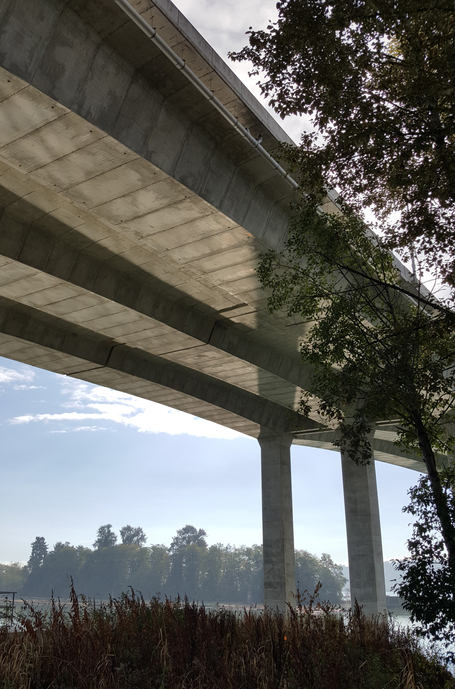
The approach spans are supported on further V-shaped piers, although here the designer presumably came up against difficulties in dealing with thermal movement of the bridge.

These piers have a cut-line near the base, indicating the presence of support bearings, presumably to allow the V-pier to move under thermal effects. It seems to me yet another poor detail, as the form of the pier is clearly unsuited to the loads and movements it experiences.

Seen from afar, the R-3 footbridge is an impressive and appropriate structure, with an impressively slender deck. It's unfortunate that the more closely you examine the details, the more you can see the very real flaws in the design,

Further information:

27 November 2017

Spanish Bridges: 1. Paloma Footbridge, Madrid


In October, I joined a trip to Madrid to see various interesting engineering structures. I've picked three of the footbridges to feature here.

The first is the Paloma Footbridge, a remarkable structure which carries pedestrians across a busy urban motorway. The 191m long bridge was designed by Cesma Ingenieros, with construction engineering by Ines Ingenieros. It was completed in October 2010 at a reported cost of only €2m.

The bridge is fascinating from a structural engineering viewpoint, but what is most immediate about it is its sense of drama. Its four spans sweep through a 90° curve to address a huge change in ground level, rising 8m in order to clear the motorway. The form is highly unusual, a group of two horizontal trusses and one inclined truss arranged in a 4m tall "C" cross-section.

It takes some time to understand quite how the structure works.

The bridge spans are supported on giant "Y" shaped columns, the upper arms of which also form part of the main load-bearing truss. This truss is then subject to a series of lateral forces which are resisted through the roof and floor trusses.

The lateral forces arise from three types of structural behaviour.

First, the vertical load from the bridge is eccentric to the piers, to the inside of the pier where the deck is straight, and to the outside of the pier due to the plan curvature where the deck is more highly curved. This eccentricity introduces a torsional warping stress which creates lateral forces in the upper and lower horizontal trusses.

Secondly, the loads are eccentric to the shear centre of the overall cross-section. For any channel-shaped section, the shear centre is outside the area enclosed by the section, on the outside of the vertical element. All loads therefore establish a further torsion acting towards the inside of the piers.

Finally, there are compression and tension forces in the horizontally-curved upper and lower chords of the main truss. These introduce lateral destabilising forces, the magnitude and direction varying according to the position along the main truss. The two horizontal trusses provide lateral stiffening to the main truss chords, and carry the out-of-balance forces back to the support piers.

The bridge is structurally ambitious but each element also fulfils an architectural purpose, with sun-shade elements on the (south-facing) main truss and also on the roof truss. These are very welcome on such an exposed site in central Spain.

The detailing of the bridge is, for the most part, excellent, and I especially like the way the Y-shaped columns are combined with, but stand out from, the main truss.

I also noted that some of the screening in the side of the structure has an enhanced density in one area, where the bridge overlooks some apartments, enhancing privacy. This has been cleverly done, so that very few bridge users will even notice it's there.

Design of the support piers cannot have been straightforward, as they need to be strong enough to resist the complex loads applied to them (I'm not sure whether they are also designed for highway impact loads), but also flexible enough not to experience undue stress when the bridge experiences thermal expansion and contraction.

There is one feature of the bridge design that I certainly can't commend. The sun screens are a welcome feature, but with an unintended side effect, which can be seen in the first video below.


There's a pronounced light flicker which can be clearly seen as you traverse the bridge. It's caused by the orientation and spacing of the screen slats, as can be seen in this second video.


If the slats were oriented the other way, or were angled or spaced differently, the flicker would be reduced or eliminated (although obviously it will vary anyway according to the direction and elevation of the sun).

I think most bridge users will hardly notice, but I can easily see it being a significant issue for people with photosensitive epilepsy, or visually dependent vertigo. As a bridge designer, it's yet another thing to add to my list of things to consider for accessible design. Many designers seem to think that just providing a shallow gradient is enough to accommodate disabled or less able bridge users, but of course disability takes many different forms.

Another aspect which detracts from the general high quality of the bridge is the parapets, which have over-sized handrails (again, not good from an accessibility point of view), and inadequate detailing at the expansion joints. As you can see in the photo, there appears to be some kind of painted duct tape over the sleeved top rail, and an intermediate element has been damaged due to poor alignment.

On the whole, however, the Paloma Footbridge is a bold, carefully considered design. Trussed footbridges are often the least-cost, most mundane solution to crossing a motorway, but nothing could be further from the truth in this case.


Further information:

19 November 2017

"Bridgescapes" by L. Bruce Keith

Bridgescapes (Dunnottar Productions Limited, 184pp, 2017) is a timely survey of Scotland's bridge heritage, published to coincide with the completion of the Queensferry Crossing. This tremendous new cable-stayed design is the 21st century neighbour to a 20th century and 19th century bridge, each an impressive example of historic achievement.

This new book is aptly subtitled "A personal journey through history celebrating Scotland's bridge-building heritage". L. Bruce Keith is an experienced surveyor (indeed, a recent President of CIWEM), but not a bridge specialist by any means. He traces his interest in bridges to his father, who was a local authority engineer responsible for bridges in the Highlands of Scotland. His book is dotted throughout with autobiographical detail, which lends a pleasingly informal touch, although much of the personal history is not directly bridge-related.

The bulk of the book is arranged chronologically, with chapters covering medieval bridges, the 18th century etc. Four chapters on 19th century bridges are arranged thematically: canals, highways, railways, and an entire chapter for the failure and success of the Tay and Forth bridges. The coverage is up to date, with a number of 21st century structures, and a chapter of its own for the Queensferry Crossing.

This is a book which will be of interest to many, although its primary audience is the general public, especially those with an interest in history, geography and architecture. As the author notes right from the beginning, "This book is not intended for 'anoraks'". There's an extensive bibliography, but nothing in the way of footnoting or references. One occasional casualty of this is factual accuracy: there are a number of claims of "firsts" and "longests" which I doubt would survive thorough scrutiny. There are also quite a few typos including a repeated mis-spelling of Babtie (as in John Babtie, whose firm Babtie and Bonn became Babtie, Shaw and Morton, eventually assimilated into the Jacobs borg in 2004).

There are also a number of omissions, although no doubt only the anoraks would be greatly concerned with many of them: Craigmin Bridge, Faery Bridge, Falls of Gharb Allt Footbridge, Maryhill House Footbridge, Roxburgh Viaduct Footbridge, Gogarburn Bridge, and Greenside Link Place Bridge are examples just from those that I've had the good fortune to visit. However, I don't see this as a significant criticism given the book's many good points.

The book opens with a reasonable introduction to the classic structural forms and materials of bridges, drawing on the many relevant Scottish examples and well illustrated with archive and newly taken photographs. This sets the tone for the remainder of the book, which is well-written, informative, sensibly prioritised, and filled with high quality images. On this count, it's great value for money, and even the anoraks should discover plenty that they didn't know, or had forgotten.

A chapter near the end of the book addresses the worldwide legacy of Scottish bridge builders and designers, which I think is a very welcome inclusion. It brings home the significance of well-known Scots such as Robert Mylne, John Rennie, Thomas Telford, and William Arrol, but also features significant but lesser known names such as Louis Harper, Peter Seton Hay and Alexander Nimmo (plus many more I'd never heard of).

I very much enjoyed Bridgescapes. It's indispensable for anyone with a serious interest in Scotland's bridges, and should be enjoyed by others with a more casual appreciation.

For details of how to purchase the book, contact the author at lbrucekeith@yahoo.co.uk.

Update 20th November: Readers of The Happy Pontist can purchase Bridgescapes for a discounted price of £18 (UK) and £25 (overseas), which I think is tremendously good value!

07 November 2017

Canadian Bridges: 8. Port Mann Bridge, Vancouver

This was the final bridge I visited on my September trip to Vancouver. The Port Mann Bridge was completed in 2012 as a 10-lane replacement for a steel arch highway bridge spanning the Fraser River. It is the centrepiece of a much longer highway improvement project.


With a 470m main span it is reportedly the second longest cable-stayed bridge span in North America (behind Mexico's Baluarte Bridge), but it doesn't even dent the top 50 worldwide. It was also briefly the world's widest long-span bridge (67m wide), before being overtaken by the San Francisco Oakland Bay Bridge (79m wide) in 2013.

I can't confess to being a great admirer of the new cable-stayed bridge span.

The choice of single pylons sitting in between twin deck sections seems at first sight to be aesthetically wise (cf. Stonecutters Bridge, Millau Viaduct, Queensferry Crossing). However, due to the bridge's tremendous width, four planes of cable stays are required, leading to quite a dense, confused appearance.

This also directly leads to the over-sized upper pylon sections, which are as large as they are solely to have enough space to accommodate the huge number of cable anchorages. Nonetheless, it is reported that this arrangement is less expensive than the alternative A-frame, H-portal or multiple mast pylons, and cost was the primary driver for the whole project.

Cable-stayed bridges often suffer from an imbalance between tower profile above and below deck, as out-of-balance longitudinal thrusts in the deck are restrained at the towers. The Port Mann Bridge has avoided that particular peril, with well-proportioned lower tower sections. T-shaped crossheads support not only the deck, but also anchor stability cables for the upper towers.

The span arrangement appears odd, but is rational. The south pylon sits well on land, while the north is in the middle of the river. The cause for this is the spacing of various obstacles: a railway yard requiring a significant span at the south end; a requirement for the adjacent tower to be on dry land to prevent any risk of scour to the riverbank protecting the same railway yard; and the position of the main and secondary navigational channels in the river.

The bridge is well known for the troubles it developed shortly after opening, with ice forming on the main cables and falling as "ice bombs" onto terrified car drivers below. This has since been treated with a mixture of hydrophobic coatings and ice-removal collars which can be slipped up and down the cables. I'm only guessing, but perhaps the controversy explains why the main bridge designer TY Lin doesn't feature the bridge on their website project gallery.

My main interest in sharing this bridge, however, is not for the main span but for the northern approach viaduct. I believe this was designed by Californian firm IBT (now part of Systra), and it's a classic post-tensioned box girder viaduct, a form in which IBT have considerable expertise. IBT are certainly happy to have the project on their website.

The arrangement is highly economical and also very beautiful. Three prestressed box girders sit on simple rectangular concrete piers. The girders are trapezoidal in cross-section, with the bottom face lightly arched. The bottom face therefore varies in width, adding interest to what is otherwise very plain.

It doesn't seem in any way unusual, but I think the detailing is excellent, with only a few lighting column and sign supports appearing as an afterthought. The concrete construction is also of excellent quality, and it's a tribute to how attractive a simple and economical engineer-led solution can be when it's delivered with such splendid clarity.


Further information: