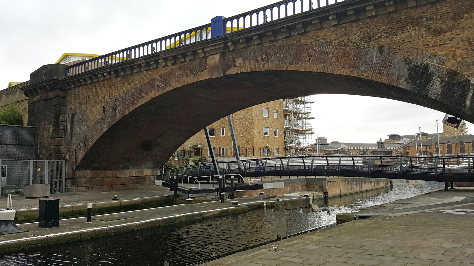
This is the last of four bridges that I visited on a recent trip to London, and the most recent, having only been completed in January 2015.

This swing bridge spans the mouth of the
Deptford Creek, where it empties into the River Thames, and it forms part of the
Thames Path on the river’s south bank. The Creek here is navigable, so this is an opening bridge. It was designed by
Flint and Neill with
Moxon Architects, with mechanical engineering by
Eadon Consulting, and built by
Raymond Brown Construction with
SH Structures.
I had seen this bridge design presented at a conference, and came to the site expecting a level of disappointment. Elevations and photographs of the bridge indicated it to be somewhat cramped and truncated in its appearance. The mast seemed too short, cut off just above the cable stays rather than allowed to reach a polite conclusion higher in the air, and the 8m backspan seemed far too short to properly balance the 44m main span, whether structurally or visually. Awkward rectangular casings surrounding the bottom of each cable were also a real distraction.

It's worth noting that this was a design-and-build project, a process often noted for its ability to compromise quality in the pursuit of cheapness. The project had previously endured a stop-start history, with a number of designs proposed without ever getting anywhere.
In reality, the bridge was not only less awful than I had feared, but quite impressive in many ways. I got the feeling that here was a design team doing their best to eke what quality they could out of a tight budget and highly constrained site.

For the most part the bridge design is attractively simple, and I particularly like the parapets, which have a very clear and uncomplicated design, making good use of stainless steel handrails and infill mesh.

The front span of the deck is a plated box girder with outriggers supporting the main deck plate, while the back span is a plated box formed from a simple folded geometry. It is over-large compared to the front span, because it is so short that it needs to be deep enough to carry sufficient ballast to maintain even loads on the bridge's support. I'm guessing that land ownership restrictions are what led to it being so short.
The parapet mesh is also featured below deck level, presumably to prevent any attempts at climbing the bridge from underneath.

The mast is also in plated steel, although in a different manner. The masts of cable-stayed footbridges are normally hollow-sections, to provide sufficient strength and stiffness against twisting effects. Here, the mast comprises two steel plates arranged in the form of an open-tipped V, held apart by flat plates in a "ladder" arrangement. The bracing plates are inclined diagonally, which provides a modicum of torsional stiffness and prevents the main plates from buckling.

Flat plates exposed to wind often generate
vortex shedding behaviour, which can cause vibration and even damage. The mast therefore incorporates a tuned mass damper half way up its height, hidden behind a cover plate, to prevent excessive vibration.

An interesting feature of the design is the use of colour. Most of the bridge is painted a very pale grey. Yellow is used to highlight the main elements of the bridge opening mechanism. A much darker grey is used for the bridges two approach ramps and western staircase, presumably to visually demarcate the main structure from ancillary elements.

The darker grey is also used on the box girder below the main deck span, including the various struts which support the deck plate. The effect is to put the structure below floor level in permanent "shadow", emphasising the thin fascia plate along the edge of the deck and making it look very slender. This is fine, but I don't think it works very well where it meets the back span: it emphasises the mis-match between the two, and leaves the front span looking far too spindly to be quite right.

I also can't admit to being a particular fan of the cable stay protection sleeves, which I assume are there to prevent vandalism. This is a difficult detail to treat successfully, and I've certainly seen far worse elsewhere, but if they are necessary, they are a necessary evil. Compare the similar detail on the
Media City Footbridge, which has no anti-vandal shrouds but which elevates the level at which the cables connect to elements of the deck steelwork.

I do, however, love the timber benches which are situated below each of the cable shrouds. These are beautifully shaped and very well made. Each one is a different size, reflecting the different inclination of each cable that they sit below. They serve the dual function of providing a resting place and also of preventing people walking or cycling across the bridge from accidentally hitting their head on the cables.

I also very much like the various gates which are used to keep people off the deck while the bridge is being opened. There are four in total, each one detailed carefully according to its location. At the rear end of the bridge, there is a curved gate which slides into place below the approach steps, and a simpler swing gate to close off the ramp (also where the bridge operator stands to control the bridge movement).
At the front end of the bridge there are two swing gates which close off the steps and ramp, and when not in use, these are detailed to dovetail against each other, minimising the space they take up. It's a neat, very well-considered detail.
Who would have thought there would be so much to discuss on what is ultimately a relatively modest bridge? To be honest, there's quite a bit more which could be said, but I think this is enough. I've included a few more photographs to illustrate some of the other features of the bridge.
Perhaps my favourite has little do with the bridge's detailed design, but more to do with its situation at the mouth of the Deptford Creek. All along the south bank of the Thames in this area there are views across towards London's Docklands district, but there's something about the bridge which makes you stop and look afresh. It's a crossing point and also a vantage point.
Further information:

 Non-Dutch speaking readers may find these books difficult to get hold of. They are available directly from the publisher at a very low price (€39.95 for this two-volume set), but I think they don't ship outside the Netherlands. Otherwise, I'd recommend that anyone interested searches for them via Abebooks.
 The 1940-1950 volume is a history of Dutch bridges in the Second World War and its immediate aftermath. An early chapter documents the preparation for a possible invasion, including the laying of explosives to allow bridges to be brought down quickly. When the Netherlands were invaded in May 1940, numerous bridges were destroyed. Some restoration work was undertaken while the country was occupied from 1940-1944, before a further phase of destruction took place as the country was liberated in 1944 and 1945.
 All of this is documented at length in the book, with numerous historic photographs, including many of the bridges damaged and destroyed during the war. There are even aerial photographs taken during bombardment which show clearly how intense the effort was on both sides to deny opponents access to vital infrastructure.
 The 1950-2000 volume has 5 main chapters, covering spatial planning, urban planning and infrastructure; factors influencing bridge construction; developments in bridge construction; particular aspects of bridges; special bridges; and Dutch bridges abroad. The lengthy chapter on developments in bridge construction is subdivided to cover concrete, steel, moveable bridges, other materials, and substructures, just to give a flavour of the book's approach and coverage.
 From what I can figure out, there is copious detail both on the context that Dutch bridges have been built within, and on the historical details of bridge design and construction technology within that context. It gives the definite impression that there is plenty of valuable information, pitched at an audience somewhere between the general public and the active professional.
 As with the previous volume, the book is very well illustrated, with plenty of photos of specific bridges as well as explanatory diagrams and photos of specific bridge technologies and details. Most are in black-and-white but a good proportion are in colour.