I posted last July when Network Rail announced this contest, but what with one thing and another, I've neglected to write about the result.
Quick recap: Network Rail were looking for ideas which were "innovative, challenge presumptions and raise expectations for the quality of future designs". The contest ran alongside a more conventional commission for a consultant team to refresh the organisation's station footbridge designs, which led to the appointment in October of Arup and Knight Architects.
The ideas competition was open to pretty much any entrant, offering a £20,000 prize fund but no commitment to use the winning idea or to commission any further work.
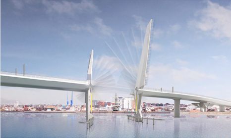
The winner was announced in December as Gottlieb Paludan Architects, Denmark, with Strasky, Husty and Partners Ltd, Czech Republic (above). The judges also highly commended a design from Hawkins\Brown with WSP (below).
There were a further 18 entries on the judges' longlist. In total, 121 entries were submitted, so clearly something about this contest struck a chord amongst the creative professions. Given the very low probability of actually getting any significant reward, it's interesting how many well-known names took part, but perhaps also unsurprising that many entries look like they were dashed off in a spare lunch-break.
One thing that strikes me about the entries is the proportion which adopt a modern or futuristic approach. I believe the competition identified the need for station footbridges which would link railway platforms in both a new-build context, and also upgrades to existing stations, some of them heritage settings. Network Rail included examples of historic lattice-truss bridges in the material they supplied to entrants, but very few designers submitted ideas which appear adaptable to different settings. There were quite a few entries with a latticework theme, but hardly any which looked adaptable to many situations.
Another thing that jumps out is that this competition probably created a significant learning opportunity - assuming (from the quality of the design images) that many of the entries will have been prepared by younger professionals, it must have been a marvellous opportunity to test out their design and illustration skills.
Many of the entries are impractical, even amongst those where an engineer is named as well as an architect. However, I think it's clear that a good proportion of entrants did understand that this was a contest about ideas - the more pragmatic looking entries generally didn't make the longlist.
I can strongly recommend spending a few minutes checking out the competition website. I'm only going to include the winning, highly commended and long-listed designs here, but although there's a fair bit of dross, there are also quite a number of thought-provoking concepts, and one or two interesting styles of illustration.
Winner: Gottlieb Paludan Architects / Strasky, Husty and Partners Ltd
The winning design is beautifully presented and highly minimalist in its conception: a staple-shaped deck below a staple-shaped roof, modular and suitable for a variety of spatial arrangements.
Highly Commended: Hawkins\Brown / WSP
Like the winner, this is a modular, adaptable design, but with the structure and architecture secondary to the potential for a bridge as a social and commercial space. It's a smart, enticing idea, perhaps well-suited to some urban locations but over-ambitious for most other sites.
Long list (selected images only: see competition website for more)
Luca Poian Forms, UK with Soluxn Ltd
Weston Williamson + Partners, UK with AKT II Ltd
Atkins Architecture, UK
PHASE3 Architecture + Design, UK with AKT II Ltd
Miguel Costa, Andy Fisher, Melanie Davison, Priscille Rodriguez & Jan Verhagen
CF.Architects, UK with Cake Industries
Softroom, UK with Eckersley O'Callaghan and Inverse Lighting
[Y/N] Studio, UK
Xing Design Studio, People's Republic of China
Pelizziarchitettura, Italy
Squire and Partners, UK
Marks Barfield Architects, UK with COWI
Sweco Architects, Sweden with Sweco Civil and Sweco Structures
Method Architecture, UK
Kashdan Brown Architects Ltd, UK
AWW, UK with Mott MacDonald
Metropolitan Studio of Architecture, Pakistan
Fereday Pollard Architects, UK
Showing posts with label bridge competition debris. Show all posts
07 April 2019
02 February 2019
Bridge competition debris part 28: Upper Orwell Crossing
In the wake of the decision to cancel the Upper Orwell Crossing project, I realised that I've never taken the opportunity to feature the losing designs in the original design competition.
All these images are taken from an article in the Architects' Journal, as only William Matthews Associates have shared details of their design on their own website.
My conclusion on looking back through these is that the Foster and Partners designs were pretty well-deserved winners. It would be interesting to see how the project budget would have turned out had some of these submissions been chosen!
I've provided further comments below where appropriate.
Adamson Associates with William Matthews Associates and Ney and Partners
These are my favourites of the losing designs - they have a real sense of style even if it's accompanied by a huge slice of impracticality.
The first of two alternative designs for the main river crossing is an unusual cable-stayed bridge, with an inverted-V tower straddling the carriageway, and supporting the two approach decks. It is a bit like two Alamillo Bridges placed back-to-back. It has the effect that the central twin bascule span appears inconsequential compared to the approaches, which I find a little disconcerting. It also feels somewhat out-of-proportion to the site - possibly something more appropriate in a larger city.
The second alternative for the main river crossing consists of a series of huge box-girder structures, like inverted pyramids, supporting a twin bascule arrangement in the middle. This feels less odd in its relationship to the river, but also overpowered by formalism. At first sight the river supports look unstable, but if there's enough weight in the system and it's well enough held down by approach spans, it is in theory stable.
The design for the shorter opening span is conventional in form (a Dutch drawbridge, with the deck suspended from overhead booms), but with a visually attractive box form for the upper boom. Again, the design does not look very stable.
Knight Architects
It's difficult to judge the Knight Architects design based only on these two images. The structure illustrated appears to be a vertical lift span, with a single tower at each end rather than the more normal pair of towers. It's not clear where the counterweights would be, and the towers don't look substantial enough to deal with any overturning loads due to wind on the raised bridge deck.
The notable feature of the design is the presence of people on the bridge while it is lifted, as much a fairground ride as a bridge in this situation. It isn't normal to permit people on a moving bridge deck while it's in operation (the Scale Lane Bridge in Hull is an exception), but it's entirely feasible. It means the bridge can't be perfectly counterweighted, but that's true of many moveable bridges today anyway.
Marc Mimram
I think there's some head-scratching required to work out what is going on with the main Mimram design here. The highway bridge deck is supported from a forest of poles, and I think the central deck sections are lifted using draw-cables, pivoting on struts below so that they don't tilt. It's somewhere between a bascule drawbridge and a lift bridge. I don't like the look of it.
The second span is supported from two arch ribs tilted at different angles to give the impression of a ladder or railway track twisting through space. It's not a straightforward design and would require foundations at a scale disproportionate to what is actually merited. To add to the fairground feel of the contest, it reminds me of a rollercoaster track.
Wilkinson Eyre with FHECOR and Eadon Consulting
Wilkinson Eyre and their partners offered two variants on the same theme for the main crossing, both with twin bascules. One has two rectangular bascule leafs with a minimal counterweight. The other uses diamond shaped leafs, in an interesting arrangement which allows the rear part of the deck to act as a counterweight. I think the axle or pivots supporting these decks would be working very hard.
The design is obviously reminiscent of the same designer's bridge at Poole Harbour, the Twin Sails Bridge. That has had a history of problems, with the bridge closed in 2012 (soon after completion), and again in December 2018. Movable bridges can be troublesome at the best of times, and adding complexity to the more normal geometry may not be the best decision.
31 March 2015
Bridge competition debris part 27: Nine Elms / Pimlico runners up
Ah, what a wonderful thing is the internet. The organisers of the Nine Elms / Pimlico bridge design competition helpfully made all 74 entries available to the public online and via public exhibitions. Initially, they made one image of each design available, although this represented only 30% of what each competing team was actually judged on. Initially, all the entries were displayed anonymously in the online gallery, so that the public would view each design in a fair manner, however, the organisers have recently revealed precisely who did what, and for most of the entries have now made available the second design board, allowing us to see 60% of what they were marked upon.
It's an impressive field of entrants. I think all the British specialist bridge architects are represented (although none was chosen as a finalist), and there are also big names (in different ways) such as Zaha Hadid, Ney and Partners, Marc Mimram, Dietmar Feichtinger, RFR, Expedition, HOK, Rafael Vinoly, SOM, Snøhetta, Foster and Partners and more.
Ove Arup and Partners participated in a staggering 17 entries, and Buro Happold in 9. No other entrant even comes close. This is not a new strategy in bridge design competitions, but it paid off, with Arup and Happold together providing three out of the four finalists.
Here are the six "runners-up", entries which the jury felt deserved some kind of recognition. Links take you to their detailed design boards, at least for as long as they remain online. I'm not going to cover any of the other entries here, there are just too many, but I will return to this contest one more time to discuss it further.
Wilkinson Eyre Architects Ltd with Aecom, Atelier One and Schlaich Bergermann
For me, this is an extremely disappointing design, particularly given the firms involved. It's hard to see what the merits are of the structural solution, which is essentially a suspension bridge system turned sideways. The shallow profile for the cable hangers means that they are not efficient at suspending the deck, especially given their connection to a main cable rather than directly to a rigid mast.
What's especially surprising about this design is that there are no cycle ramps, only cycle channels within staircases - these are okay for keen adult cyclists going upwards, but useless in the downwards direction and for younger or less fit cyclists. As this is a key challenge for the contest and the site, how on earth did this get judged as a runner-up?
Farshid Moussavi Architecture with Bollinger and Grohmann Ingenieure
I find it hard to express quite how much I dislike this design. It makes no structural sense whatsoever. It's like someone has admired Anish Kapoor's 110m long outdoor sculpture, Temenos, and mistaken it as an idea for a bridge. It's not. The design boards talk about the arches being inclined backwards to counter-balance the cable forces, but they're not shown with sufficient weight, stiffness or inclination for this to be at all feasible.
The ramps also lack credibility, especially at the south end of the bridge where there simply isn't space in reality for the length of ramp illustrated.
Eric Parry Architects Ltd with Richard Deacon AKTII
I think this is a design where the image doesn't do it justice. Any arch solution would be expensive to build and difficult to do so without disruption to river traffic. In the design's favour, pedestrian and cycle traffic are properly segregated. It's one of very few entries which didn't follow the obvious route across the river, instead disgorging its users half-way along a busy footway at the south bank. I think it's pretty mediocre, certainly compared to some of the rejected entries.
Atkins Ltd with Grimshaw Architects
This twin-mast cable-stayed design is mildly reminiscent of the South Quay Footbridge in London's Docklands, at least in its original configuration, with two inclined masts supporting an S-shaped deck. It's a rational solution, with ramp arrangements and engineering which makes sense, although I think the giant glowsticks have a garishness more appropriate to a children's Halloween party than blown up at this scale. But it's not a big sin.
The deck is very wide, 10m, and this requires cable stays on both sides of the deck, which is a less elegant solution than at South Quays.
Coffey Architects with Buro Happold
It looks like a plank, or perhaps a ruler placed temporarily on a walnut-wood architect's model as a placeholder while someone else in the team worked on the actual bridge design. I like the bold concision of this proposal, which would be London's first stress ribbon bridge, and a remarkable feat if ever built. However ... it is supposed to be a bridge which happily accommodates cyclists, and it's hard to see how forcing cyclists up in the air in giant lift towers satisfies that aspect of the project brief. Because a stress ribbon inevitably sags between its supports, the support towers have to be quite tall, and because it requires a very high tension force in its supporting cables, those towers have to be large and heavy, with correspondingly heavy foundations. It's bold, but the jury would have been very brave if they'd made it a finalist.
Ove Arup and Partners Ltd with Studio Egret West
At first glance, I thought this striking design might involve plastic composites, but it turns out this is a proposal for an all stainless steel bridge. Since the jury generally appeared to be looking for sensible, affordable solutions, it's hard not to wonder quite how such an expensive idea made it to the shortlist.
There are some nice features, like a cafe below its southern ramp, and a proposal to build the two halves parallel to the river and then rotate them into their final position. But these have to be set against a bizarre intention to cross-over the cycle and pedestrian routes at midspan, introducing an entirely pointless mid-river pedestrian crossing.
The contest organisers have now released the jury report to competitors, and once I've had time to digest it, I'll return with some final thoughts on this competition.
Subscribe to:
Posts (Atom)