Showing posts with label Santiago Calatrava. Show all posts

03 February 2019

Separated at birth?

Glasgow City Council has published the design for a new bridge across the River Clyde connecting Govan and Partick, next to the Riverside Museum. The bridge is to be 110m long, with an opening span of 63m, and a swing bridge has been chosen so that the bridge can operate in high winds.

The bridge has been designed by CH2M Hill (now part of Jacobs), who in their previous incarnation Halcrow have previously delivered quite a few Clyde crossings. It's expected that a planning application will be made this summer, with the intention to complete construction in 2021.

The budget has been previously stated as £10m, but I don't know if that's accurate.

So ... spot the difference.


The top picture is the new Govan-Partick bridge. I'm sure any similarity to the Puente de la Mujer in Buenos Aires, shown in the second picture, is entirely coincidental.

I was especially amused to see that the artist tasked with visualising Glasgow's new design adhered so slavishly to their brief (presumably "copy this one please, pal") that they even included a sailing ship.

Or maybe this was their source material:


That one, of course, is in Dublin, and does at least have some back-stays unlike the Buenos Aires span or its Glaswegian clone. What is it about these bridges and sailing ships, anyway?

I don't think there's anything else I really want to say about the Govan-Partick bridge right now, so here are some more visualisations, and a rendered video:


23 October 2017

German Bridges: 9. Oberbaum Bridge, Berlin


This is the last of the bridges I visited in Berlin in September, and it's going to be short and only a little sweet, as I only visited at night, and very briefly. It's Berlin's most notable bridge, so clearly I'll have to cover it more thoroughly next time I get a chance to visit.


I'll let you read about the bridge at the links below, I'll only comment briefly on the photos.


The bridge carries light rail on its upper level and a highway and footways on the lower deck. The upper central span was rebuilt in 1996 to a design by Santiago Calatrava, and I think it's one of Calatrava's best designs: constrained by working so closely with such a historic bridge, he was obliged to deliver something more modest than usual, and it's a beautifully elegant span which sits well amidst the much more lavish architecture of the historic bridge.


The arch itself seems impossibly thin, although this is a trick of the design, which uses triangular cross-sections for the arch ribs and main deck to emphasise slenderness. There are struts at each end of the bridge supporting the upper level (presumably reducing loads on the historic viaducts), but you generally don't notice them.


Seen up close, the new span is a very modern, almost industrial structure, but seen from further away it appears fragile. As with several other bridges over the River Spree, it was built as a result of German reunification, and may be politically symbolic.


Further information:

16 October 2017

German Bridges: 5. Crown Prince Bridge, Berlin

Ok, with the BAMPOTs out of the way, it's back to Berlin, and continuing steadily eastwards along the River Spree (the next bridge to the west is the Gustav Heinemann Bridge).


Santiago Calatrava has designed two bridges in Berlin. The Kronprinzenbrücke was completed in 1996, and is the result of a 1991 design competition. I may cover his other bridge later on in this series.

The previous bridge at this site had been demolished to reduce the number of East German refugees fleeing into West Germany. The Crown Prince Bridge was funded following German reunification and was presumably quite a significant symbol of the need to rebuild cultural and physical connections.

It's not a huge bridge - it's only 74m long, with a main span of just 44m. It carries a highway and walkways across the River Spree.

Calatrava's design owes something to his earlier (unrealised) Wettstein Bridge. It gives the appearance of being a skeletal steel arch bridge, while in reality being something different. The main bridge span is supported via lateral steel beams onto two "arches" running beneath the deck, and inclined outwards.

There's no a priori reason not to use vertical "arches"; the tilt is just typical Calatrava playfulness, part of an effort to generate a visually more dynamic geometry for the steel skeleton.

I put "arches" in quotes because on the face of it this actually appears to be a cantilever bridge, with Vierendeel trusses spanning outwards from the support piers, and given the illusion of arches by the adoption of shallow arch curvature. If these were true arches, the shallow curvature would lead to very high longitudinal thrust loads, and the support piers are not arranged in such a way as to resist those loads.

Instead, the piers are arranged to resist lateral thrusts, in line with the river. This is purely a function of the arch tilt, which is severe enough to put the piers into considerable lateral tension. It appears to be resisted by the very visible "knee" elements, but these just carry the loads into the interior of the lower concrete part of the piers. It's not visible to the observer, but inside the concrete there are large steel portal frames, which act as ties to restrain the lateral forces.

It's a "plinth" bridge of sorts, a visually attractive and interesting superstructure which is perched upon rather than integrated with its supports. The obvious way to resist the lateral forces at the piers is through a horizontal tie at springing level, but this spoils the purity of the superstructure's conception. The result, as with many Calatrava bridges, is that the substructure is forced to work unusually hard to allow the upper parts to remain unsullied.

As with Calatrava's better designs, much of the detailing of the bridge has been very well done. However, it's hard to tell how much of that is down to Calatrava and how much to other engineers charged with realising his design. Several details in the completed bridge differ from those in original design drawings (included in Frampton's book, linked below).

Look closely at how the arch spandrel elements are connected both to the arch and to a tubular deck girder, or at the shaping of the thrust supports on the bridge piers. The tilted parapets are attractively assembled, and the parapet ends are quite gorgeous, finely sculpted blocks which put so many other bridge designs to shame.

Shaped arch elements on the face of the abutments give an indication of load paths - abutments are too often blank, blocky and unattractive, but not here. This is particularly significant for a bridge which is experienced at close hand from the river side paths.

Not everything is great: the underside of the bridge deck is given texture and form by the exposure of a large number of ribs and service pipes, but it feels over the top to me. The upper chords of the Vierendeel trusses are also absurdly large compared to the lower chords - this appears to be solely so that pipes can be hidden inside.

Some considerable effort has gone into detailing the highway face of the bridge, with bespoke kerb lighting units and lighting columns. However, the curse of poor maintenance has left these looking forlorn, and in some cases damaged and corroded.

Nonetheless, I think this is on balance an interesting and attractive bridge, lacking in the overpowering and inhuman scale that ruins many of Calatrava's later projects.

Further information:

31 March 2017

The Great White Hoop: Five years of the Margaret Hunt Hill Bridge

Here's an interesting article on a Calatrava bridge in Dallas, Texas. I don't like the bridge, but the piece offers an interesting perspective on the limitations of building such a monumental structure without any real regard to its context. I'm mainly sharing the link, however, because there are some excellent photos at the end of the article.

http://www.dallasnews.com/news/news/2017/03/24/great-white-hoop-five-years-margaret-hunt-hill-bridge

06 February 2017

Calatrava in Greenwich

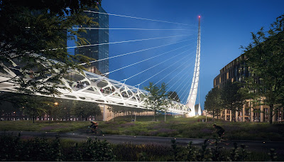
Plans have been announced for Santiago Calatrava's second bridge in the UK (the first being 1995's Trinity Footbridge). Yes, there's a whole load of other stuff as well, some yuppie flats and a super-sized greenhouse, but that's not what you read the Happy Pontist for, is it?

Ok, a little context. Calatrava's "Peninsula Place" is just part of a huge £8.4bn redevelopment of London's Greenwich Peninsula, albeit a key part as it includes the gateway underground station. The development is somewhat controversial, largely because of the very small proportion of "affordable" housing which is to be included, following pressure from the developers.

Calatrava's scheme is as grandiose as you would expect. The bridge is intended to link his part of the site, with station and apartment blocks, to the riverside.


It's a cable-stayed structure, so tall that they couldn't even fit all of it into one of the publicity images. In much of Calatrava's recent career the designer seems to have been largely rehashing all his older ideas, while making his designs steadily bigger and steadily more illogical. In line with this principal, he has chosen to stitch together two previous designs to make this new one: Calgary's Peace Bridge, and Valencia's Serreria Bridge.

Frankenstein would have been proud.

The bridge somewhat resembles a giant white snake shedding its skin, rearing up like some kind of super-sized horror-film monstrosity. It's far from clear what it actually spans (only a cycleway is shown in the visualisations), but it seems unlikely that it needs to be this big for functional reasons: like many of Calatrava's recent bridges, its giganticism seems purely symbolic.

The mast is restrained by a single vertical cable, necessitating enormous foundations to counter-balance the main span. (Perhaps it's also symbolic: look, the success of this enterprise is hanging by a thread.)

The curvature of the mast is to some extent structurally rational, as it reduced bending moments and hence should in theory slightly reduce the amount of steelwork required.

The main span is a tubular truss, with metalwork arranged in an intersecting helix, which evokes a futuristic sensibility without actually being structurally sensible in any way: there's a Jane Austen joke in there somewhere, I'm sure.


From the images, it seems as if the mast is on the riverside, which feels the wrong way round to me: the more visually and physically massive part of the bridge should be anchored further inland, I think.

Assuming this entire project doesn't go belly-up following an Brexit or Trump-related economic meltdown, I'm confident this will be a very interesting scheme to watch over the next few years.

17 April 2016

"Calatrava: Complete Works 1979 - today"

Weighing in at 596 full colour pages for £35, Philip Jodidio's latest Calatrava tribute is exceptionally good value for money (Taschen, 2015). It updates an earlier edition, and at first glance seems to offer everything anyone could possible want to know about the world's favourite Spanish architect/engineer.

In fact, there's a clear breach of trading standards law on the proper description of goods here: despite the voluminous contents, this is nothing like a "complete works", with a large number of projects relegated to a list in an Appendix rather than featured properly. Of the four Calatrava bridges that I've written up on this blog, two are included (James Joyce Bridge and Ponte della Costituzione) but two are not (Katehaki Bridge and Trinity Footbridge). So, set the title to one side before considering a purchase.

It's no surprise that this is a super-fat brochure rather than a work of architectural criticism. Jodidio's stock in trade is invariably affirmative, congratulatory fare, and there's little here to enlighten the curious reader about the success, or otherwise, of Calatrava's completed works. Instead, this book is about bludgeoning the recipient with space-age spectacle: page after page after page of visually stunning, technologically futuristic geometries wrought in economically and environmentally unsustainable mega-tons of concrete and steel.

It's principally a visual book, with lightweight text making way for countless large-scale photos of Calatrava's characteristically grandiose oeuvre. There are some images at Amazon which will give you a good flavour of the style. Many of the photos are united by the absence or near absence of humanity, architecture frozen in that perfect moment when the cranes have left the scene but the public have yet to arrive, majestic sculptures unblemished and unsullied by the messy business of real people, traffic, or the stains to be accumulated in later life by inadequate maintenance.

In this respect they contrast significantly with Calatrava's sketches and watercolours, plenty of which are included. These frequently reference the human scale, and the relationship of the designer's abstract geometries to a poetic understanding of birds, the body, the eye and other humanist and natural inspirations. It's often interesting to try and trace a relationship between the architect's delicate and beautifully coloured artwork to the bleach-white structures that result.

Despite its flaws, I'm very glad I acquired this book. Calatrava is a monumental egoist, but also a singularly creative talent, and rare amongst architects for his willingness to exploit and explore structures rather than simply to hide them behind facades. His designs for various transportation hubs and stations are frequently spectacular in a positive way, sitting somewhere between the greatest Victoria station sheds and lofty cathedral spaces.

His designs are often uncompromising in their willingness never to say "no" - many would baulk at the challenges involved in realising his more epic designs, and there is surely a place in the world for the gargantuan, the astounding and the lavish. At the same time, Calatrava is a master of small details, of shaping not just the overall form but every element to work well together.

I particularly admire his occasional debt to history, as in the sweeping roof forms of the Bodega Ysios winery, which are a direct tribute to Antoni Gaudi's school building in Barcelona.

24 July 2015

10 essential bridges books: 9. Calatrava Bridges

And so, we come to Santiago Calatrava.

Calatrava is something of a phenomenon in modern bridge design, and is often cited, quite wrongly, as being singlehandedly responsible for making bridges architecturally interesting. His designs are often immediately recognisable - his combined training as both an architect and as an engineer has led him to produce structures which combine visual drama with structural rigour, a kind of spacial poetics, usually writ large in tons of carefully balanced steel.

Calatrava Bridges (Tzonis and Donadei, Thames and Hudson, 272 pp, 2005) is ten years out of date now but remains the most up-to-date guide to this superstar's bridges, both built and unbuilt. As with most other books about the Spanish designer, it is in no sense a critical work, but is a celebration of his P.T. Barnumesque showmanship.

Calatrava's work is much-derided by other architects and engineers, if supposedly much loved by the public. Even the latter appears less true now, as he has a growing reputation for budget and programme over-runs as much as anything else. Fellow designers criticise the way that his bridges rarely respond to context, instead taking a signature style (white, generally steel, a cat's cradle of cables, hi-tech detailing) and dropping it into whatever setting is currently to hand. His bridges are bombastic, grandiose, sometimes over-wrought to the point where they become almost hysterical. Modesty and restraint are never Calatrava's watchwords.

However, as this book makes clear, Calatrava's work is also often geometrically fascinating, spectacular, and informed by a deep love of engineering craftsmanship and technology. That they are instantly recognisable puts other designers to share: he is the supreme bridge design stylist, happy to provide his signature wherever his clients are willing to pay for it. Few designers have been so prolific or so consistent, and if Calatrava has many unbuilt projects to his name, he also has far more completed works than most rivals.

Tzonis and Donadei's book is well illustrated, with plenty of beautiful photographs and quite a few diagrams and architect's sketches. It is not thorough in this regard - this is a good summary of the designer's work but certainly not the definitive encyclopaedia.

Reading through the book today, I am actually most struck by Calatrava's facility for concrete design. His unbuilt Vecchio Bridge would have been a particularly elegant, Maillart-esque concrete arch, while his 9 d'Octubre Bridge in Valencia features some exquisitely shaped curved concrete.

He is also occasionally capable of surprise, with his grey Oberbaum Bridge in Berlin and red-ribbed Ponte della Costituzione in Venice both being fine designs which are all the better for their departures from his usual palette.

A properly critical study of Calatrava's bridges has yet to be written, but until that happens, this book is at least a useful compendium of his work, and one that I am quite happy to recommend.

02 February 2015

Irish Bridges: 3. James Joyce Bridge, Dublin

Dublin is the lucky possessor of not one but two bridges by the renowned Spanish engineer, Santiago Calatrava. Both are highway bridges, spanning the River Liffey, built in steel and painted white. The James Joyce bridge is, by Calatrava’s flamboyant standards, an essentially modest design, completed in 2003. The other structure, the Samuel Beckett Bridge, is a case of extravagance at its most extravagant, a hugely gymnastic cable-stayed bridge with a passing resemblance to a harp, which is not only a piece of spectacularly ambitious sculpture, but adds to the spectacle by swinging open from time to time. On this very quick trip, I only had time to visit the simpler of the two bridges.

Designed in collaboration with Roughan O'Donovan, the James Joyce Bridge is one of Calatrava's better structures. It is relatively straightforward in conception, with two steel arches inclined outwards from a central highway, supporting the road and footways and helping define attractive and generous pedestrian spaces.

High strength Macalloy steel bars connect the deck to the arches, each hanger consisting of a pair of bars in a manner typical of Calatrava designs. The footways are supported on crossbeam cantilevers, and have a glass-block deck and glass-panel balustrades.

The overall form of the bridge is attractive from almost every perspective, but what I admire most about this bridge is the detailing, which has clearly been done with considerable care. It's a bridge simple in overall concept yet complex in the detail; I like it a lot.


Further information:

14 May 2013

Katehaki Bridge, Athens


Late in 2012, I visited Athens, not a city generally noted for its bridges. However, I did get time to visit perhaps its most striking contemporary design, Santiago Calatrava's pedestrian bridge at Katehaki. This 94m long, 50m tall bridge was built in 2004 as an offshoot of Calatrava's other activities in Greece, designing the Athens Olympic stadium.

I had seen photos of the bridge beforehand, and like many of Calatrava's recent bridge designs, felt it was an example of a tendency to take things to extremes, unnecessarily so.

What makes this bridge seem so preposterous is the treatment of the cable-stay back span. In an asymmetric cable-stay bridge, where the main span is longer than the back-span, the back-span cables are generally anchored to the ground to provide the necessary stability. In most such bridges, the back-span cables are angled so that they provide a horizontal force, helping the bridge's mast to resist the horizontal pull from the main-span cables.

On the Katehaki Bridge, the back-span cables are instead vertical, resisting none of the sideways pull from the main span. Instead, that pull is resisted through the curvature of the pylon, as a compressive thrust. The curvature is a rational choice rather than simply a sculptural affectation - the pylon can be thought of as a uniformly loaded arch turned on its side, with the thrust at either end of the arch restrained either by the ground support or by the vertical back-span ties. The pylon is therefore essentially funicular in its form - its geometry responds directly to the forces applied to it.

As with many of Calatrava's bridges, the pylon form is well-sculpted, and the recessed cable anchorages are, in my view, visually a very successful detail. At its base, the pylon comes to a perfect point, with the weight of the entire bridge carried onto a support pedestal through a simple steel plate pivot, which cannot be more than an inch or two thick. The photo (right) shows this detail, and also shows the challenge to the bridge's fabricators of achieving Calatrava's continuous, curved forms - it's essentially impossible without fabrication tolerances making the welded plate joints more visible than would be desirable. The bridge was built by the Greek contractor Metka.

Katehaki Bridge was to be something of a prototype for Calatrava's much larger Puente de l'Assut de l'Or, in Valencia, a 180m long, 125m tall cable-stayed bridge of the same overall form. In both bridges, the pylon is offset to one side of the deck, an arrangement that Calatrava is inordinately fond of and which allows the sculptural nature of his structures to be expressed with great visual clarity. The penalty is that both pylon and deck are subject to significant lateral and torsional forces, adding considerably to the overall cost.

At Katehaki, the tendency of the deck to twist is addressed by building a steel box girder along one edge, incorporated into the parapet height so as to reduce its overall visual impact. The cable stay anchors are on the inside face of this box, which helps to counteract the tendency to twist.

The opposite edge of the deck supports an open post-and-rail parapet, an arrangement which can be used to strong visual effect where there is a desire to orient bridge users towards certain viewpoints. That doesn't seem to be the case here - it's simply an artefact of the prior design decisions.

The decking is formed in short timber planks, all lined up neatly rather than staggered. These are supported on steel ribs, and the whole deck is cross-braced to provide in-plane stiffness. The underside of the deck is given a somewhat scabby appearance by the deteriorating finish of the wood planks, although the top-side still looks very good.

There is some nice detailing at the end of the bridge away from the mast, where a triangular frame supports the bridge deck (I confess, I didn't take any note as to how the bridge may cope with thermal movement). The adjacent lift shaft and staircase structure has an attractive white terrazzo finish.

On the whole, the bridge does not feel out-of-scale to the task which it accomplishes, spanning a highway tunnel and two adjacent two-lane carriageways. It certainly makes crossing a busy traffic junction easier, as I found when having to cross other parts of the junction to take some of these photos.

Although the shape and height of the mast announces clearly the very conscious creation of a landmark (the bridge is unmissable on a car journey into the city centre from Athens airport), the more intimate features of the bridge have generally been detailed with care, and it's pleasant to walk across.

Perhaps the only thing that I find odd, and this is as a northern European visiting a southern European country, are the open-air escalators which provide access at both ends of the bridge. It's impossible to imagine such exposed machinery lasting long in a northern climate, although here they are simply an extension of the adjacent subway station, which is also entered via exposed escalators.

Overall, I very much enjoyed visiting this bridge, it strikes me as a very successful design (at least visually - it cannot have been particularly cost-effective).

Further information: