This is another interesting pedestrian bridge that I found on a visit to Cambridge earlier this year.
The Riverside Footbridge spans the River Cam and its flood plain, a little way north of the city centre.A design competition was held in 2003-4 for the site, with six teams shortlisted. The winner was Whitbybird with Gerry Judah, with Royal Haskoning as runner-up. The competition entries are visible on the Cambridge Cycling Campaign website (the unbuilt entry from Marks Barfield and Babtie is also here).
The bridge was opened to the public on 5th June 2008, and carries pedestrians and cyclists on segregated paths. To the west of the river, one long structure carries users across the river floodplain, while on the east, the bridge ramp runs southwards parallel to the river.One thing I found really strange about this layout is there is no easy access to the riverside on the west, and no easy way off the bridge to the north on the east side. A couple of staircases would have solved both issues.
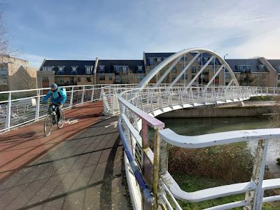
The design is at first glance one of a very particular type of white-painted steel arch structures popularised by Santiago Calatrava, and adopted by almost everyone else. In particular, it seems to owe something to Whitbybird's earlier Merchants Bridge, in Manchester.On closer examination, it's quite a bit different from the "classic" tilted arch footbridge although clearly derived from that concept.The tubular steel arch spans across the river onto thrust foundations. Below deck level, the slender arch member is welded to much larger angled plinths, which I suspect must work quite hard under varying thermal conditions.
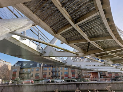
The deck carrying the cycleway sits to the north of the arch, suspended from it by steel braces. Cranked horizontal cross-ribs correspond to each brace, running back below the arch to support the footway deck. The cycle deck is a closed steel box-girder, providing torsional restraint to the whole system, while the footway deck is an open-framed system.The cross-ribs are suspended from steel bars which hang vertically below the arch at intervals. The hangers, struts and cross-ribs form a series of triangles spaced evenly along the length of the arch, a highly formal composition that then seems to determine the overall geometry of the structure. The cycleway deck forms a smooth curve in plan, but the footway deck does not, its geometry seeming much less logical. Together, it's visually complex, and to my eye a little uncomfortable.The cycleway deck is fixed to the arch supports, and the ramp extensions are continuous, with no joints until their far ends. The approach ramps are supported on steel piers via sliding bearings. The piers on the west approach are "7"-shaped, and although they are pleasing enough, when seen together with the deck steelwork, the underside is rather messy.The input from the sculptor, Gerry Judah, is minimal, and seems to mainly consist of two circular platforms semi-attached to the western ramp, like pimples (the designers called them "buds"). I say "semi"-attached, as they are mostly structurally independent except for small cleats which I'm guessing contribute to their lateral stability.They feel a little like an afterthought, and the space they provide, with piddly little circular benches and pointless masts, isn't sufficiently pleasant to justify the investment that clearly went into detailing them.If the underside of the approach ramps is untidy, the underside of the main span is just plain unsightly. From down here you get the best view of a tie bar that connects the ends of the arches and which just adds to the visual clutter.
One day, people will realise quite how bad these white tubular steel bridges look after a few years if allowed to accumulate dirt rather than being kept clean.
It's clearly a difficult site for a footbridge, with the design challenges including the floodplain, the constrained approach directions, and the need to find something for the artist to contribute. I'm quite sure I could have designed something a lot worse. But I didn't admire this bridge: there's too much going on, and the desire for crisp detailing is let down by the compromises made to hold it all together.
Further information:


No comments:
Post a Comment