All these images are taken from an article in the Architects' Journal, as only
William Matthews Associates have shared details of their design on their own website.
My conclusion on looking back through these is that the Foster and Partners designs were pretty well-deserved winners. It would be interesting to see how the project budget would have turned out had some of these submissions been chosen!
I've provided further comments below where appropriate.
Adamson Associates with William Matthews Associates and Ney and Partners


These are my favourites of the losing designs - they have a real sense of style even if it's accompanied by a huge slice of impracticality.
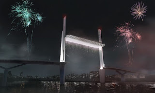
The first of two alternative designs for the main river crossing is an unusual cable-stayed bridge, with an inverted-V tower straddling the carriageway, and supporting the two approach decks. It is a bit like two
Alamillo Bridges placed back-to-back. It has the effect that the central twin bascule span appears inconsequential compared to the approaches, which I find a little disconcerting. It also feels somewhat out-of-proportion to the site - possibly something more appropriate in a larger city.
The second alternative for the main river crossing consists of a series of huge box-girder structures, like inverted pyramids, supporting a twin bascule arrangement in the middle. This feels less odd in its relationship to the river, but also overpowered by formalism. At first sight the river supports look unstable, but if there's enough weight in the system and it's well enough held down by approach spans, it is in theory stable.
The design for the shorter opening span is conventional in form (a Dutch drawbridge, with the deck suspended from overhead booms), but with a visually attractive box form for the upper boom. Again, the design does not look very stable.
Knight Architects
It's difficult to judge the Knight Architects design based only on these two images. The structure illustrated appears to be a vertical lift span, with a single tower at each end rather than the more normal pair of towers. It's not clear where the counterweights would be, and the towers don't look substantial enough to deal with any overturning loads due to wind on the raised bridge deck.
The notable feature of the design is the presence of people on the bridge while it is lifted, as much a fairground ride as a bridge in this situation. It isn't normal to permit people on a moving bridge deck while it's in operation (the
Scale Lane Bridge in Hull is an exception), but it's entirely feasible. It means the bridge can't be perfectly counterweighted, but that's true of many moveable bridges today anyway.
Marc Mimram
I think there's some head-scratching required to work out what is going on with the main Mimram design here. The highway bridge deck is supported from a forest of poles, and I think the central deck sections are lifted using draw-cables, pivoting on struts below so that they don't tilt. It's somewhere between a bascule drawbridge and a lift bridge. I don't like the look of it.
The second span is supported from two arch ribs tilted at different angles to give the impression of a ladder or railway track twisting through space. It's not a straightforward design and would require foundations at a scale disproportionate to what is actually merited. To add to the fairground feel of the contest, it reminds me of a rollercoaster track.
Wilkinson Eyre with FHECOR and Eadon Consulting
Wilkinson Eyre and their partners offered two variants on the same theme for the main crossing, both with twin bascules. One has two rectangular bascule leafs with a minimal counterweight. The other uses diamond shaped leafs, in an interesting arrangement which allows the rear part of the deck to act as a counterweight. I think the axle or pivots supporting these decks would be working very hard.
The design is obviously reminiscent of the same designer's bridge at Poole Harbour, the
Twin Sails Bridge. That has had a history of problems, with the bridge closed in 2012 (soon after completion), and again in
December 2018. Movable bridges can be troublesome at the best of times, and adding complexity to the more normal geometry may not be the best decision.


