Five finalists have been announced in the ongoing contest to design a wildlife bridge over the I-70 Highway in Colorado. The original shortlist featured 36 entrants.
I've provided a short note below each entry summarising the structual form, but there is much more information on each design at the competition website.
Balmori Associates (New York)
with StudioMDA, Knippers Helbig Inc., David Skelly, CITA, Bluegreen, John A. Martin & Associates, and David Langdon
This design involves a series of transversely laminated timber "plates" which are sculpted to give an organic form underneath. It's clearly the contribution of Knippers Helbig as there's a family resemblance to their Margaretengürtel design.
The Olin Studio (Philadelphia)
with Explorations Architecture, Buro Happold and Applied Ecological Services
The Happolds influence is apparent in the structural form, which is a weathering steel diagrid (Happolds being known for their expertise in gridshell roofs). Overall, it's shaped as a hyperbolic paraboloid, or hypar (also known as the "pringle"), which provides stiffness through curvature rather than depth.
Janet Rosenberg & Associates (Toronto)
with Blackwell Bowick Partnership, Dougan & Associates, and Ecokare International
Structurally, this is the least interesting design, featuring a timber and plastic composite deck used to support fibreglass composite screens. Some of the images make the decking look a little like a scaffold platform.
Michael Van Valkenburgh & Associates / HNTB Engineering (New York)
with Applied Ecological Services, Inc.
Hypars are clearly flavour of the month, because HNTB have also used them in this design, although in a very different way to the Happold entry. The bridge has a series of precast concrete ribs, each of which is made up of a thin concrete shell in hypar form. L-shaped ribs are propped against each other to form three-hinged arches, which would be both lightweight and stiff. The ease of erection, and adaptability to different spans and geometries, make this one my favourite, although architecturally it's less spectacular.
Zwarts & Jantsma Architects (Amsterdam)
with OKRA Landscape Architects, IV-infra and Planecologie
Finally, here's another hypar, this time in the form of an in-situ concrete shell. Thin shells of this type are rarely used in bridge construction, partly because they perform well when subject to evenly distributed loads, and less well against concentrated loads. A wildlife bridge, with its plentiful earth fill, is a rare case where the geometry makes sense. However, in-situ concrete is problematic, and the designer has had to illustrate a complex temporary cable net, suspended on stays, to support the formwork. This might add an unwelcome cost as well as cause greater highway disruption than some of the alternatives.
30 November 2010
28 November 2010
London Bridges: 5. South Quay Footbridge
On a recent trip to London, I had time to visit three footbridges. All have in common the fact that they are moveable structures, opening to waterborne traffic; that their design had the strong involvement of an architect; and that they are a few years old now. These are definitely not the latest designs, but they all remain interesting in one way or another.
The first, South Quay Footbridge, was the collaborative design of Chris Wilkinson (now Wilkinson Eyre) with Jan Bobrowski & Partners (now Capita Bobrowski), who won their commission in a design competition run by London Docklands Development Corporation. It was a slightly unusual contest by modern standards: a shortlist of six engineers was invited, and given a list of possible architects to team up with.
In its original form when it opened in 1997, the bridge connected the quay walls of a dock basin at Canary Wharf in east London, providing an S-shaped walkway, each half of the 'S' suspended from an inclined mast. The two masts inclined in opposite directions, and the south half of the bridge could pivot open when water vessels needed to pass through (which was not often).
It cost £2.5m, and was 180m long. The masts were 30m tall, and along with the cables carried a deck supported on one side only by a steel tube. The bridge decking was of oak planks (now long since replaced with metal grating due to the oak's slipperiness). The contractor was Christiani & Nielsen.
It was a masterpiece of landmark footbridge design, a brilliant concept which perfectly met the requirements of the site. I very much enjoyed the first time I visited it, its combination of simplicity and dynamism.
It was always intended that further construction work would take place to narrow the dock, by building a new quay wall on the north side (to the right of this photo), and removing half of the bridge. It was planned that the section removed could be used elsewhere, and this was one of the interesting features of the original design. Indeed, the bridge in its original form lasted barely three years before its span had to be reduced.
The reality, however, is that the bridge was emasculated, and the unfortunate peculiarities of Docklands land development have made its context more problematic.
It’s still a striking structure, with the harp-strung mast thrusting priapically into the sky. The mast is circular at its base but narrows at its tip, a forerunner of the more refined mast shaping adopted by Wilkinson Eyre at the much more recent Swansea Sail Bridge.
It seems inconceivable that the bridge's pivot support could be large enough for the deck to remain balanced when it opens.
The deck support girder is a 914mm tube, from which the deck cantilevers. The cantilever members are hidden below deck, but their presence is indicated on the tube by a series of "collars", which I think are one of the bridge's less successful details.
The adoption of two very different styles of balustrade is a feature that has appeared on many Wilkinson Eyre designs. The emphasis is on the walkway’s role as an outward-facing promenade, although at the cost of a somewhat obscured view on the opposite side, where the perforated plate screen is too high for comfort. Wilkinson Eyre described it as a "man-made hedge" i.e. a wind-shield.
The bridge originally sloped upwards to provide clearance over the middle of the dock water, but now it lands at a level higher than the rest of the dock quay – the slope has no visual rationale any more, and it lands awkwardly onto a set of steps which prevent disabled access, and, more importantly, place a barrier right across the pedestrian desire line. Approaching from the north, it’s uninviting and intrusive.
Presumably there was no space for a ramp, because immediately to the north, the footpath is now blocked by a massive glazed atrium, connecting two offices and sheltering the way down to what appears to be an underground shopping mall. Again, coming from the north, this obscures views of the bridge, negating its role as a landmark, and making the pedestrian experience at best unfriendly, and at worst intimidating.
This part of the Docklands has always been a prime example of the harm done to the public realm by permitting its existence only within the terms of privatised land, and this atrium is emblematic of the negative legacy of the way Docklands development was promoted. Where there should be generous and artful public space, instead there are barriers, security guards, and the resulting consciousness that everyone is an intruder, your presence and passage resented.
This may seem something of a digression, but what was once a splendid bridge has been greatly diminished by the increased corporate colonisation of its context.
Further information:
- Google maps / Bing maps
- Structurae
- A Cable Stayed Swing Bridge, Jim Eyre, in The Architecture of Bridge Design, ed. David Bennett, 1997
- Wilkinson Eyre: Bridging Art & Science, Chris Wilkinson & Jim Eyre, 2001
- South Quay Footbridge[PDF] (Graitec Software)
- Critical Analysis of the South Quay Footbridge, London [PDF]
- Starting from Scratch: the development of transport in London Docklands
Labels:
footbridges,
London,
London bridges series,
moveable bridges
27 November 2010
Bridges news roundup
Working on the Peace Bridge like ‘sculpting a piece of art’, say tradesmen
Calatrava's Calgary bridge delayed (again) until June 2011. The Calgary Herald blames the delay on problems with the quality of the welding. The contractor "admits the job is simply bigger than some imagined", whatever that means. It's not the designer's fault.
IStructE Structural Awards 2010
These were announced a little while ago now, but I haven't mentioned them previously. Bridges featured in the awards included Stonecutters Bridge, which received the Supreme Award for Structural Engineering Excellence, as well as the Award for Transportation Structures. The Forth Road Bridge Main Cable Project won a David Alsop Sustainability Award Commendation. the Award for Pedestrian Bridges went to Bristol's Meads Reach Bridge, with the Forthside Bridge commended.
Collection of Variable Depth Footbridges
The Spanish blog Frame and Form has posted some great pictures of Mario Guisasola's footbridges, none of which I'd seen before, and all of which are well worth a look for their unusual approach to girder geometry. See also the second part.
Opponents accused of 'wrecking' tactics as Connect2 bridge design approved
Bland £2.6m arched footbridge design favoured to span River Tay in Perth, Scotland. Quite why the arch is cheaper to build than a suspension bridge (an option that seems never to have been properly offered to the public), I'm not too sure.
25 November 2010
Nervi Bridges: 6. Messina Straits Bridge
I've got one final bridge design by Pier Luigi Nervi to cover in this post and conclude this series.
At the end of the 1960s, Nervi was amongst engineers asked to propose a design for a bridge across the Messina Straits, between Italy and Sicily. The depth of water in the Straits meant that the bridge had to cross about 3km in a single span (although other designers, such as Leonhardt, were still proposing designs with deep-water piers at the same time - see the book by Richard Scott linked below).
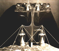
Nervi's contemporary and compatriot Sergio Musmeci proposed a peculiar suspension bridge where the suspension cables are hung not directly from towers, but from cable stays which are in turn suspended from super-towers beyond the ends of the main bridge. Musmeci's idea included lateral cables either side of the deck to provide it with transverse stability.
Although this was an odd design, the proposal by Nervi was even stranger.
Nervi sought to achieve lateral stability by inclining the main suspension cables away from the deck, so that the deck hangers are no longer vertical, and the towers supporting the main cables are separated by a considerable distance.
The towers are hyperparaboloid concrete shells capped with enormous steel assemblies. They're restrained by stays to resist the incredible horizontal forces they would have to carry.
It's hard to imagine how Nervi thought this bridge might be erected. The main cables would have to be aerially spun with a conventional vertical sag, and then additional horizontal cables slung between them in order to pull them into the correct inclined alignment, at which point the deck segments could be fixed in place. I can't imagine how it could possibly work on this scale and the design is therefore, at best, fanciful rather than pragmatic.
The deck itself appears to be a trapezoidal concrete box which would be incredibly heavy and attract enormous wind loading.
On the whole, Pier Luigi Nervi was not a great bridge designer. Few of his ideas were taken up by others, largely because his attempts to maximise material efficiency were always at the cost of construction complexity, leading to greater cost overall. They also weren't always successful aesthetically.
In February I made a series of posts on the bridges of Eduardo Torroja, another concrete shell innovator, and whose bridges, like those of Nervi, are far less impressive than his better known designs. Was there something about the dedication required to become a master in one field that inhibited their intuition in a second field? None of the other great shell designers (Candela, Dieste, Isler, Hossdorf) seems to have left behind any great bridges either. If anyone has a counterexample, I'd be interested to hear it!
Further information:
- Messinacity: Il Ponte di Pier Luigi Nervi 1969 (Italian)
- In the wake of Tacoma: Suspension bridges and the quest for aerodynamic stability, Scott, 2001
- Pier Luigi Nervi: bridge designer [PDF], Manuel Cresciani, IASS Symposium 2007
- Pier Luigi Nervi and the Art of Building [PDF], Fausto Giovannardi, 2009
Labels:
highway bridges,
Italy,
Pier Luigi Nervi,
suspension bridges
23 November 2010
Nervi Bridges: 5. Opera Overpass, Ankara
Considering its highly unusual structural form and very site-specific arrangement, you might think that Pier Luigi Nervi's Ponte del Risorgimento, in Verona, was a one-off.
Surprisingly, you would be wrong, as Nervi elected to essentially repeat the design concept for a highway interchange in Ankara, Turkey, designed and built in the period from 1968 to 1973. The structure carries a highway across the Ataturk Boulevard, with associated slip roads.
It has the same basic form as the Verona bridge, a continuous concrete girder where the width of the top flange is held constant while the width of the bottom flange is varied in response to the degree of compression it carries. So the bottom flange is wider over the support positions, and the external girder web curves constantly to accommodate this.
The bridge deck is completely divorced from its supports, which are essentially twin T-shaped piers distorted to an extreme. The pier stem and crosshead morph into near-triangular masses, allowing the "crosshead" to be kept very slender at its end point. The skin of the piers is far more organically curved than in most of Nervi's column designs, but it all looks quite incongruous, a curious blend of the squat and the skinny.
The tightly curved interchange slip roads are quite different in form to the main spans. These sit on a series of bizarre supports which combine the attributes of a cone and a cruciform section, clearly intended to minimise use of concrete while maximising stability. Nervi had used cruciform section columns in several other structures, including the Corso di Francia viaduct, but I think the Ankara version is unique.
Further information:
- Structurae
- Archnet (I have used their images of the bridge, which are (C) Aga Khan Trust for Culture, with permission)
- Google maps / Bing maps
- Photograph of bridge pier
Labels:
highway bridges,
Pier Luigi Nervi,
Turkey
21 November 2010
Nervi Bridges: 4. Ponte del Risorgimento, Verona
In 1961, the town of Verona held a design competition for a new bridge across the River Adige, partly to celebrate the centenary of Italian unification. Apparently, the results were uninspiring, and set to one side. Two years later, Pier Luigi Nervi was invited to prepare a design, which went on to be built, opening in 1968. The bridge was built by Edilbeton, who offered a lower tender than Nervi's own firm, Nervi e Bartoli.
The river is 131m wide, and Nervi proposed a three-span bridge with a central span of 62m and two symmetrical side-spans of 34.5m each. This partly echoed the existing upstream bridge, Ponte Catena, which had three roughly equal arch spans. It's a cellular reinforced concrete box girder, with its cross-section varied in response to the bending moment and shear force envelopes.
The soffit is curved to enhance the girder depth at the bridge piers, where the hogging bending moment (and also shear force) is greatest. The bottom flange thickness also varies, increasing at the piers to carry the resulting increased flange compression force. These are both concepts common to bridges of this type.
However, Nervi also varied the width of the bottom flange in response to the moments, so that is wider at the piers, where greater compression capacity is required, and narrower at midspan. The top flange is kept at a constant width, so Nervi created a bridge where the slope of the side walls varies continuously.
At the piers, the cross-section is of a trapezium with the bottom flange wider than the top, while at midspan, the reverse is true.
There is a hydraulic as well as structural logic - the side wall of the deck juts out above the piers to form something like a cutwater, helping to divide flood flow and creating a downward thrust under flood. The shaping at midspan may reduce hydraulic drag under flood conditions.
To the modern engineer, the varying girder depth and flange details are sufficient for an economic design - the curved side walls, shaped as hyperbolic paraboloids, require expensive varying formwork, and make detailing of the internal reinforcement more difficult.
Personally, I'm not sure that the visual effect justifies the effort. It's an intriguing design, but not so startlingly attractive as to make the cleverness seem the result of necessity rather than whim.
Further information:
- Google maps / Bing maps
- Wikipedia (Italian)
- Structurae
- Pier Luigi Nervi, bridge designer [PDF], Manuel Cresciani, IASS Symposium 2007
- Pier Luigi Nervi: Architecture as Challenge, Silvana Editoriale, 2010
Labels:
highway bridges,
Italy,
Pier Luigi Nervi
18 November 2010
Nervi Bridges: 3. California
Following the Corso di Francia viaduct, Nervi designed a 160m span roof support structure for the Burgo Paper Mill in Mantova in 1961 which was clearly bridgelike, if not actually a bridge. The picture (courtesy of Michele Molinari on Flickr) shows one half of it, and it has the same form as a suspension bridge (the half not shown in the picture is symmetrical).
In 1962, Nervi was asked to prepare bridge designs for the Kaiser Steel Company in San Francisco. He developed both steel and concrete designs for an elevated highway, pictured below:
This concept shows Nervi's usual concern with the shaping of the bridge pier legs both to achieve structural efficiency and also improved appearance. The portal legs are more attractive than the T-shaped supports for the Corso di Francia Viaduct, but it's certainly not an especially innovative design.
The following year, California's Department of Public Works invited Nervi to submit a proposal for a bridge at San Mateo Creek, some 550m long and up to 76m tall.
It's worth comparing this to Nervi's 50m tall River Tenza Viaduct design of eight years before, with its peculiar reinforced concrete trestles. Perhaps the experience at Corso di Francia had allowed Nervi to determine that elevated viaducts didn't require oversized frames to provide their stability, and that a more conventional bridge pier arrangement could be made to work.
However, the San Mateo Creek still has hangovers from the early days of concrete design, such as the use of hinge joints at the base of the pier legs and between the two crossbeam elements. Hinges were normally adopted in reinforced concrete either to make the design calculations easier, or to facilitate differential movement e.g. caused by mining-induced ground settlement. It's hard to see why they were adopted here, in a seismically active state, since Nervi had dispensed with them for the Corso di Francia Viaduct earlier.
The bridge deck illustrated also seems to be the V-shaped beams Nervi had used at Corso di Francia, although the picture is unclear.
A recent book on Nervi's works, Architecture as Challenge, lists Californian proposals by Nervi at San Mateo Creek, Fort Sutter Viaduct and Embarcadero Viaduct, and pictures a further design with giant X-trusses which might be a double-decker viaduct.
Further information:
- Structurae (Burgo Paper Mill)
- Great Buildings Online (Burgo Paper Mill, including drawings)
- Pier Luigi Nervi, bridge designer [PDF], Manuel Cresciani, IASS Symposium 2007
16 November 2010
Nervi Bridges: 2. Corso di Francia Viaduct, Rome
In 1956, Pier Luigi Nervi became involved in a number of structures for the 1960 Rome Olympics. Most notably, this included the two indoor sports arenas, Palazzo dello Sport and Palazzetto dello Sport, and the outdoor stadium at Flaminio. It also included the Via Olimpica viaduct, now called the Corso di Francia Viaduct.
The Corso di Francia runs right through the middle of the Olympic Village. Apparently, it divided the housing for male athletes, to the east, from that for female athletes, to the west, although any notion of propriety was ruined by the use of the viaduct by Italian men to spy into athlete's bedrooms (I don't know how true this story is).
The road had to be elevated to allow free passage of athletes and spectators throughout the site, and the use of T-shaped piers by Nervi may have been an attempt to maximise space at ground level and reduce visual obstruction (see picture left - all colour photos are courtesy of Nicolas Janberg at Structurae).
While the structure is more conventional than the two early bridge designs I featured last time, it still has its share of idiosyncrasy.
The columns have an unusual varying section, from rectangular at the top to a cruciform section at the base. This enhances stability while also adding to the visual interest, and Nervi frequently provided varying columns in his designs. The Palazzetto dello Sport has some, as does his roughly contemporary UNESCO building in Paris.
The beams are 16m long, precast and prestressed, a simple and economical solution for bridge viaducts that seems unusual for Nervi, who was not a great user of prestressing. More unusually, they are V-shaped in cross-section, with a very narrow bottom flange, and with the top flanges placed in contact. The overall cross-section of each viaduct therefore consists of a "corrugated" or V-wave profile, which is essentially similar to the approach Nervi had taken on a number of roof structures, including the Palazzo dello Sport.
Nervi's design for the viaduct is featured in Fritz Leonhardt's Bridges. Leonhardt notes that the bridge did not age well, with water seeping through joints and down the piers (I imagine the deck was discontinuous, as on the Midland Links viaducts in the UK, which have been notoriously plagued with leakage and associated concrete degradation).
Leonhardt also criticises the adoption of column and crosshead piers to support the deck beams. Although this is the most straightforward solution to build, it is visually more congested than the alternative of having the crosshead integral with the deck and within its depth. The latter approach, however, requires temporary propping of the deck beams and construction of a more difficult joint detail.
Further information:
- Google maps / Bing maps
- Structurae
- Pier Luigi Nervi's works for the 1960 Rome Olympics [PDF], Iori & Poretti, Actas del Cuarto Congreso Nacional de Historia de la Construcción, Cádiz, 2005
Labels:
highway bridges,
Italy,
Pier Luigi Nervi
14 November 2010
Nervi Bridges: 1. Early bridges
Pier Luigi Nervi (1891-1979) was one of the greatest Italian structural engineers of the twentieth century. Indeed he was one of the greatest designers anywhere in the world, a pioneer of large-scale reinforced concrete roof structures, highly successful as the engineer, architect and builder of his own works.
His many astonishing designs include St Mary's Cathedral in San Francisco, the Palazzo and Palazzetto del Sport in Rome (the former is pictured, right, courtesy of Jeroen Meijer on Flickr), the Papal Audience Hall in the Vatican, and exhibition buildings in Turin.
A hallmark of his approach was the use of ribbing to stiffen thin-shell construction, leading to geometrically intricate vaulting reminiscent of the Gothic architecture that Nervi undoubtedly admired.
Unlike his contemporary and compatriot Riccardo Morandi, Nervi is less well known for his bridge designs. Nonetheless, he produced enough of interest that I'm going to cover them in a short series of posts here.
Nervi designed several reinforced concrete bridges early in his career. I've found references to:
I'm not aware of many concrete trestle bridges which were built: this was a design essentially harking back to the great timber trestle viaducts of the 19th century.
Two decades later, Nervi's plan for a bridge over the river Tenza was equally unconventional. According to The Works of Pier Luigi Nervi, the designer's main challenge was to reduce the amount of scaffolding required for a viaduct which was some 50m above the valley floor.
The 319m long viaduct had trestle supports at a maximum 50m interval, four with identical geometry and hence the option to reuse the falsework and formwork. These trestles support main concrete cantilever beams, which vary in width, having a thicker web above their support positions, where the shear is highest.
The cantilever beams in turn support precast span beams, lifted into position from ground level. These span only 16m, sitting on roller bearings on their half-joints.
In 1947, Nervi designed the roof structure for the Conte Trossi Wharf in Genoa, which if not a bridge, was certainly bridge-like. The relationship of the reinforced arch to the "deck" slab above is more than a little reminiscent of Robert Maillart's bridge design at Tavanasa.
In 1959, Nervi published a critique of five bridges (Cinque ponti), discussing the Salginatobel Bridge, Rodenkirchen Bridge, Golden Gate Bridge, Elbe River Bridge, and a bridge project by Paolo Soleri. Nervi used his critique to contrast two possible methodologies for structural design:
Further information:
His many astonishing designs include St Mary's Cathedral in San Francisco, the Palazzo and Palazzetto del Sport in Rome (the former is pictured, right, courtesy of Jeroen Meijer on Flickr), the Papal Audience Hall in the Vatican, and exhibition buildings in Turin.
A hallmark of his approach was the use of ribbing to stiffen thin-shell construction, leading to geometrically intricate vaulting reminiscent of the Gothic architecture that Nervi undoubtedly admired.
Unlike his contemporary and compatriot Riccardo Morandi, Nervi is less well known for his bridge designs. Nonetheless, he produced enough of interest that I'm going to cover them in a short series of posts here.
Nervi designed several reinforced concrete bridges early in his career. I've found references to:
- Bridge over River Cecina, Pomarance, Pisa (1920-22, demolished 2001)
- Bridge over Pescia Creek, Pistoia (1922-23)
- Widening of Bisenzio Bridge, Prato, Florence (1923-32)
- Fosso Biedano, Rome (1934, unbuilt)
- Bridge at Arno (1945, unbuilt)
- Reno, near Sasso Marconi, Nologna (1951, unbuilt)
- River Tenza, Salerno (1955, unbuilt)
I'm not aware of many concrete trestle bridges which were built: this was a design essentially harking back to the great timber trestle viaducts of the 19th century.
Two decades later, Nervi's plan for a bridge over the river Tenza was equally unconventional. According to The Works of Pier Luigi Nervi, the designer's main challenge was to reduce the amount of scaffolding required for a viaduct which was some 50m above the valley floor.
The 319m long viaduct had trestle supports at a maximum 50m interval, four with identical geometry and hence the option to reuse the falsework and formwork. These trestles support main concrete cantilever beams, which vary in width, having a thicker web above their support positions, where the shear is highest.
The cantilever beams in turn support precast span beams, lifted into position from ground level. These span only 16m, sitting on roller bearings on their half-joints.
In 1947, Nervi designed the roof structure for the Conte Trossi Wharf in Genoa, which if not a bridge, was certainly bridge-like. The relationship of the reinforced arch to the "deck" slab above is more than a little reminiscent of Robert Maillart's bridge design at Tavanasa.
In 1959, Nervi published a critique of five bridges (Cinque ponti), discussing the Salginatobel Bridge, Rodenkirchen Bridge, Golden Gate Bridge, Elbe River Bridge, and a bridge project by Paolo Soleri. Nervi used his critique to contrast two possible methodologies for structural design:
- "designers, following the statical, constructive and economical needs, and within the margins of freedom in defining structural and formal details, which they always and anyway concede, try to express their own aesthetic sensibility."
- "designers start from a purely formal conception, very close to what sculptors could have, and then begin to improve it, with the sub-conscious thought that the 'calculator' will manage to make it stand and the constructor will be able to build it."
Further information:
- Wikipedia (Italy) (Ponte sul fiume Cecina)
- The Works of Pier Luigi Nervi, Pier Luigi Nervi, The Architectural Press, 1957 (Biedano, Conte Trossi Wharf, Tenza)
- Pier Luigi Nervi, Ada Huxtable, Mayflower, 1960 (Conte Trossi Wharf, Tenza)
- Pier Luigi Nervi, bridge designer [PDF], Manuel Cresciani, IASS Symposium 2007
11 November 2010
Footbridge proposed over River Trent at Gainsborough
Design proposals have been published for a new pedestrian bridge in Gainsborough, designed by Houchell Studio and TALL Engineers. The 276m long bridge has an estimated construction cost of £6m. That strikes me as a little on the light side, comparing for example the not entirely dissimilar 315m long Derry Peace Bridge which has a price tag of £8.7m.
The bridge is S-shaped in plan, and suspended by cable stays from two symmetrical pylons. The South Quay Footbridge comes to mind as a possible precursor, although that was a swing bridge. What's perhaps most striking about it is the very shallow inclination of the pylons, which seems at least visually to be lower than might normally be expected.
The deck is to be shared by pedestrians and cyclists, and the bridge provides a link in a circular route including riverside paths.
The client, Gainsborough Stakeholder Network, currently has no money to build the bridge, and is now seeking sources of funding.
Tower Bridge engineering tours
Applications are being invited for engineering tours of Tower Bridge in London.
These will take place from 17th to 23rd January 2011. The tour will include access to the parts of the bridge not normally open to the public, including the control room, machinery rooms, and the huge bascule chambers (into which part of the bridge deck rotates when the bridge is opened to shipping).
The cost is £30 per person.
(Image courtesy of Stuart Barr on Flickr).
10 November 2010
Bridges news roundup
Cracks appear in Pulteney Bridge as the debate goes on
Bath's iconic inhabited bridge to be propped up on scaffolding.
Atkins acquires Danish bridge company
Gimsing & Madsen join up.
3 teams in running to build SR 520 floating bridge project
New US$900m bridge in Washington state, USA, due for completion in 2014.
Lack of technical knowhow brought CWG bridge down
Contractor blamed in Delhi Commonwealth Games footbridge failure, and UK supplier Macalloy is drawn into the criticism.
Bridge bosses unveil plan for visitor centre
New Forth crossing may create opportunity for long-wanted visitor facility.
08 November 2010
Fehmarn Link bridge images and video released
The Fehmarn Belt link is the third super-bridge to be proposed in Denmark (the others being the Øresund Bridge and the Great Belt Link). The bridge proposal is currently being tested against an immersed-tube tunnel alternative, with a decision to be made next year on which will proceed. The three links together connect Denmark to Sweden and Germany across significant stretches of water.
The 17.5km long bridge option is being designed by a COWI / Obermeyer joint venture, with Dissing + Weitling as subconsultant architect (D+W worked on the other two link schemes previously, and COWI worked on the Great Belt). They have just released a set of images (below), and this video:
The bridge has four cable-stayed spans, slung from three V-shaped towers. These support one level of highway deck on truss girders sheltering a lower rail deck.
The V-shaped configuration of the towers is unusual for a bridge on this scale, as the inclined towers are more expensive to construct, and don't help brace each other when complete, as in the more conventional A-frame tower. However, they have been beautifully sculpted by Dissing + Weitling, and look very attractive from most viewpoints.
I'm not entirely convinced about their appearance from the perspective of a moving driver, it looks a little disconcerting, opening attention to the wedge of sky above rather than offering the psychological security of an A-frame or Y-frame solution.
The central tower has double legs, a feature sometimes used on multi-span cable-stay bridges to enhance the stiffness of the pylon and hence the entire system (it was also used on the Rion-Antirion Bridge and Millau Viaduct). It's odd to see it here, as I'd have thought the trussed deck offers sufficient stiffness (as in the design proposals for the Mersey Gateway).
Update 9 November:
I've received a few more images of the design directly from Dissing + Weitling:
Labels:
cable-stayed,
Denmark,
highway bridges,
railway bridges
07 November 2010
Providence River Pedestrian Bridge: Shortlisted designs released
I'm sadly way too busy to give these a thorough review right now, but the eleven shortlisted designs in this contest have been released for public view via Flickr.
From a quick look, there are at least one or two entrants with interesting features, but if you have more time than I do, I invite you to play "guess the designer" for each one (the entries are anonymous but the eleven entrants are known), and report back here!
The winning design is due to be announced at the end of the month.
Labels:
bridge design competitions,
footbridges,
USA
04 November 2010
"Dan Cruickshank's Bridges: The Heroic Designs that Changed the World"
Whenever a book about bridges comes along which is aimed at a broad, general audience, the expectation is that it may be a bit on the shallow side, certainly for the reader with greater specialist knowledge. Dan Cruickshank is an architectural historian best known in the UK for his populist TV documentaries, such as Around the World in 80 Treasures and Adventures in Architecture. His television style is enthusiastic to the point of being gushing, and I worried that his latest book, Dan Cruickshank's Bridges: Heroic Designs that Changed the World (Collins, 384pp, ISBN 978-0007318186, 2010) [amazon.co.uk] might prove somewhat superficial.
I shouldn't have been concerned. Bridges is certainly full to the brim with Cruickshank's trademark passion, but it balances this with a well-informed, wide-ranging and erudite approach to its subject.
Cruickshank presents a potted survey of bridges in ten chapters, each organised partly around a historical period and partly around a related theme. Thus the chapters cover "Empire" (Roman bridges), "Forging the Railway Age", as well as the more oblique "Defining Places" and "Works of Art".
Some context is offered by a lengthy, rambling introduction, which discusses a number of important structures (Zhaozhou Bridge, the Old Bridge at Mostar, Charles Bridge in Prague etc), as well as drawing in the likes of Marcel Duchamp, Kabbalah, Charles Dickens and Canaletto. The introduction manages to establish bridges as artefacts of legend, the physical residue of acts of wilful magic, as well as to delineate the basics of structural form and materials.
The ability and desire to hop rapidly between the realms of folklore, history, technology and wider cultural topics is central to Cruickshank's expansive approach to his subject. Ordinarily, I dislike the kind of book which sees bridges simply as a convenient hook on which to hang the author’s interests in folk history, where the anecdotal and incidental is given precedence over the supposed subject at hand. This book's digressions (of which there are many) kept my interest, largely because they do generally shed light on cultural attitudes to the products and processes of engineering.
For example, there's a thorough discussion on Islamic views of paradise, by way of introduction to the three great bridges of Isfahan, Iran (Si-O-Se Pol, Pole-i-Khaju, and Pol-i-Chubi). While they are architecturally extravagant and impressive, the bridges are not technologically significant, and a knowledge of their place in Shah Abbas's garden city undoubtedly adds to their appreciation.
The book's early chapters return repeatedly to the concept of a bridge as a place of habitation, rather than simply as a means of crossing obstacle. There are bridges supporting homes, tea rooms, travellers rests, and fortifications, and bridges as places to promenade upon, or as the sites for pilgrimage. Cruickshank is generally good on the "whys" as well as the "hows" of bridge building – their roles as military corridors, monuments to kings and gods, religious sites in their own right. Particularly interesting is the resulting way in which bridges are funded, e.g. the English taxing the French to pay for bridges intended to facilitate continued English military occupation in France.
The book is filled with a love of engineering, and the ways in which the functional can also be beautiful, or at least, "just". Writing on Eiffel's Garabit Viaduct, Cruickshanks suggests that "truth is synonymous with beauty and thus [it] is the pinnacle of excellence". He even finds beauty (or at least, splendour) in the colossal latticework of New York's Queensboro Bridge, probably not a structure often admired for its good looks.
Queensboro is one of several bridges where the author's personal touch really brings the book to life. Similarly, his chapter on early railway bridges is viewed largely through the lens of Stephenson's Newcastle High Level Bridge, and it's Cruickshank's account of his own exploration of the structure that stands out beyond the diligent research. The choice of such structures is generally sure-footed, with great but less well known bridges rubbing shoulders with their more famous cousins, the Brooklyns, Vecchios and Salginatobels.
Imagining myself into the shoes of a lay reader, I think it's an excellent book, accessible but informative, seeking to share an enthusiastic understanding of structural behaviour with a wider awareness of the part that bridges play in society.
As a professional bridge designer, I found some of the technical explanations to be inexact, some to the point of being wrong. For example, the book reports that the Millennium Bridge and Basse-Chaîne Bridge suffered from the same type of oscillation, and elsewhere that suspension bridges are destroyed by an increasingly rapid flutter phenomenon (the speed is roughly constant, it's the amplitude of oscillation that increases). It also sometimes misses the significance of technological innovation, as with the Severn Bridge where the inclined hangers are cited as the key design achievement, rather than the adoption of the aerofoil box girder deck.
These are quibbles, irrelevant to the book's intended readership, and they shouldn’t trouble the technically knowledgeable either. There's little in Dan Cruickshank's Bridges that the well-read pontist couldn't find elsewhere, but the love of bridges, both as engineering feats and for their wider role in history and society, shines through every page, and that's what makes it such an enjoyable book.
Subscribe to:
Posts (Atom)