29 May 2019

"The Queensferry Crossing - Vision to Reality" by David Watt

This the second of three "souvenir" books about recent major bridges in the UK that I'm going to feature here.

The Queensferry Crossing - Vision to Reality (Lily Publications, 224 pp, 2017) is a hefty, coffee-table tome, documenting Scotland's latest big bridge in exquisite detail. Grab the hardback if you get the chance, but the reprint softback is good value at £18.95 (both editions can currently be found on amazon.co.uk at reduced prices).

The author, David Watt, was for six years the Communications Manager for Forth Crossing Bridge Constructors, and brings to the book a combination of thoroughness and clarity. Compared to the Mersey Gateway book that I discussed last time, this is a much more in-depth document, diving much further into the detail of how the project was delivered.

As with the Mersey Gateway, the Queensferry Crossing is a three-tower cable-stayed bridge, but at a significantly larger scale, with a longest span of 650m compared to 300m. The towers at Queensferry are some 207m tall, and the bridge deck sits much higher above much deeper water. The scale and location mean that several aspects of design and construction were very difficult.

A key design challenge for a multi-span cable-stay bridge is how to provide adequate stiffness, as only a limited number of cables are effectively anchored to the ground through end piers or abutments. The Mersey Gateway relies on the stiffness of the bridge deck to reduce demand on the towers, while the Queensferry Crossing adopts a more innovative solution, with crossover of cables at midspan providing the necessary rigidity. Queensferry is not unique (see for example the Viaduc sur la Rocade Sud in Rennes, France), but I think it pioneered this solution at such a large scale.

The Mersey Gateway was constructed with the help of a temporary access bridge, but this was not feasible for its Scottish cousin. Accordingly, one of the bridge's biggest challenges was logistical: where to fabricate and assemble the components, and access to the mast positions via boat. Many of the components were produced overseas (in Poland and in China, for example), and fortunately the project benefited from the proximity to the bridge of Rosyth Docks, a large area of which was taken over by the contractor and used as a storage, assembly, and casting yard.

The book is split into nine chapters, topped and tailed with discussion of the need for a bridge, project development and procurement, and sections on community engagement, environmental issues, and the bridge opening celebrations. There's a lengthy credits list for firms involved in the project, but I did find it extremely odd that the book nowhere mentions the bridge's architect, Dissing + Weitling, who seem to have been largely written out of the project's history.

The core of the book covers the bridge's design and construction, although the challenges of writing about design are apparent in that it gets only 10 pages while construction gets 118 pages. Every section of the book is well illustrated, often with spectacular photographs, and the construction section also has plenty of detail - even down to an image of the cable strand wedges!

As a record of the project, it's fantastic, but after a while the level of detail does get a little numbing, and I can't admit to having absorbed it all.

The book goes out of its way to recognise some of the many people involved in the project, with lots of images of members of the project team, and interviews with five of them.

Further information:

26 May 2019

"The Mersey Gateway - A Bridge To Prosperity"

It's not unusual for major bridge projects to mark their completion with a souvenir booklet of some kind. I've recently got hold of three examples where they have gone a bit further and an entire book has been published to celebrate the occasion.

The first of the three is Mersey Gateway – A Bridge to Prosperity (118pp, 2018), published by the project's client and bridge owner Halton Borough Council. The Mersey Gateway connects the towns of Runcorn and Widnes across the River Mersey and Manchester Ship Canal, providing a new route for highway traffic, bypassing the Silver Jubilee Bridge built in 1961.

The new river crossing is a three-tower cable-stayed bridge with an unusual configuration, having a central tower visibly shorter than the two other towers. The new structure has been built to provide improved traffic capacity, reduce reliance on ageing infrastructure, and improve travel times not just locally but for nearby areas, particularly Liverpool and its surroundings.


The book concentrates on the client's view of the scheme. There is very little information on the engineering or architectural design of the bridge, not even an explanation for why the central tower is shorter, to give just one example. However, the book makes up for this with its strong coverage of the bridge's economic and social benefits.

The structure of the book is not chronological, but instead sets out to grab attention from the start. A description of the project's history and development doesn't start until page 77. Instead, the first chapter documents key features of the construction phase: the temporary trestle bridge, foundation cofferdams, the moveable scaffold systems (MSS), deck construction, cable stays, traffic management, and the opening ceremony. It's a well-chosen selection of highlights from the project's construction timeline.

There are short interviews with two people involved in the project: tower crane operator Peter McDonough and visitor centre volunteer Evelyn Edwards. I'd like to have read more of these, as my own experience of major projects is that a huge number of people contribute, and they often have plenty to say.


The second chapter emphasises community and people, including education outreach, local training and apprenticeships, recognition of women in engineering, community volunteers, and also the work of the Mersey Gateway Environmental Trust. This really shows what matters to the project client on a project such as this: it's not just all about quantities of steel or traffic statistics.

The third section, on design, environmental assessment and other aspects of the development phase, is weak by comparison – perhaps it's because I'm a designer by trade, but I feel this was a lost opportunity to tell this part of the story. It reads pretty much as if nobody involved in producing the book had actually spoken to anyone involved in design. The weakness continues into the fourth and final section, which attempts to credit the main project participants but which I think will leave most readers little wiser about what some of those involved actually did.

This reflects the nature of the book as the celebratory record of a very substantial achievement: Halton is a small local authority now responsible for two of the UK's largest bridges – they are right to be proud and to emphasise the benefits of the scheme beyond the bridge as a structure. This also means that the book (like most souvenir publications) has a uniformly optimistic, positive narrative – if anything went wrong along the way, if difficult challenges were overcome, those stories are absent.

The bridge's graphic layout is excellent, and there is a wide range of excellent photographs of the bridge and its construction (taken by David Hunter, and some of them reproduced here). The author or authors are uncredited, but the writing is very clear, and particularly good at explaining engineering and construction issues in lay terms – much better at this than I would normally expect.

It isn't the easiest book to get hold of – I wasn't able to locate anyone selling it online, and I got my copy by contacting Curiosity Bookshop in Runcorn directly – if they still have it in stock, they can take an order over the phone and post the book out (it costs £9.99 plus postage).

Further reading:

19 May 2019

Winner of bridge design competition for Irish National War Memorial Gardens

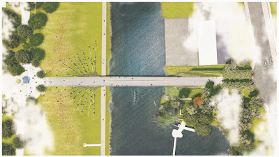
The Royal Institute of the Architects of Ireland and the Irish Office of Public Works have announced a winner in their design competition for a new bridge at the Irish National War Memorial Gardens. The bridge will span the River Liffey and provide a new entrance to the Gardens for pedestrians crossing from the river's north bank.

In the 1930s, architect Edwin Lutyens designed a three-span arch bridge at the site, pictured below, but it was never built.


The winner receives a €15,000 prize (and the hope that their bridge may be built). Two runners-up receive prizes of €7,500 and €5,000, and two further entries were Commended. In total, the open competition received 61 entries from 9 countries.

Winner
Ian Ritchie Architects / Schlaich Bergermann Partner


The winning design is, in the words of the designer, "the most slender and shallow structural arch that is technically possible." It is constructed of stainless steel, with parapets in the form of a screen of reeds, and with footprints on the deck surface intended to commemorate soldiers who never returned from war.

There's more than a little sense of déjà vu about this bridge design. The same team also won the Stratford-upon-Avon bridge design contest back in 2006, which was also a super-slender stainless steel arch design. That project was cancelled in 2008 due to escalating costs.

Here's the "calligraphic brush stroke" image which is used on the e-architect website for the Stratford bridge:


And here is an image taken from Ian Ritchie Architects' web page for their new Irish design:


I'm sure the resemblance is entirely coincidental.

Second Place
Weston Williamson + Partners / AKT II

The details of this design are unclear, but it it is described as having three girders, with views down through the bridge to the river.

Third Place
Niall Montgomery + Partners / J. B. Barry and Partners / Billings Jackson / Conway McBeth / John Spain Associates / Scott Cawley


This is another steel girder structure, with a granite surface and extensive landscaping works. Standing stones are engraved with illustrations taken from the War Memorial Record Books.

Commended
Seán Harrington Architects

I expect there's an engineer involved, although the RIAI don't see fit to credit anyone other than the architects in their competition announcement. This design is an arch-supported stressed ribbon bridge, a graceful modern version of the original Lutyens proposal.

Commended
Bystrup Arkitekter and Designere ApS

The final design is stated as being in weathering steel, with a layout which tapers in plan to accentuate the visual perspective when arriving at the Memorial Garden. Of all the designs selected by the competition judges, this one feels the most out of place to me. I also think that forming the curved portal frame shape in weathering steel would be rather difficult.

Bonus entries!
The RIAI haven't released a gallery of any other entries, but here are two more that I've found on the internet. If anyone else would like to email me a copy of their entry, I'll add it here when I get a chance.

Cake Industries / BEaM


This is an attractive and ambitious design, with complex geometry, an interesting combination of materials, and a ramp down to the river bank. I'm only guessing, but I suspect the judges may have thought that it competed for attention rather than paid due deference to the War Memorial Gardens.

Fairfax and Sammons


If the quality and style of illustration won the prize, this would easily be my favourite, a beautifully rendered bridge in traditional style. I think the designer wasn't entirely clear whether they wanted an arch or a suspension bridge, and went for a bit of both.

Updated 2 June 2019
Matter Architecture / Webb Yates Engineers / Churchman Landscape Architects


This entry was named the "Ring of Stone" bridge, comprising a loop of prestressed granite, with the inner parapet in solid granite and the outer made from recycled glass elements.

Studio Bednarski / Cundall / Robert Holden


A "living bridge" supporting an avenue of trees on weathering steel box girders.

Hugo Silvestre


With it's slender arch and balustrades-of-reeds, this has more than a few similarities to the winning design.

01 May 2019

Telford Station footbridge


Recently, I was in the town of Telford in Shropshire, and spotted this fairly spectacular new covered footbridge. It connects Telford Central railway station to the town centre, and replaces a previous bridge which was in poor condition. The new bridge opened to the public on 30th November 2018, with the project costing £10.3 million.

There are actually two new bridges, each with a similar design by Jacobs and Nicoll Russell Studios. They were fabricated by SH Structures working for main contractor Balfour Beatty.

The shorter structure spans over two railway tracks, while the longer structure is an impressive 90m long and crosses a dual carriageway road. It's not easy to photograph in a way that makes sense of both structures and their relationship to their surroundings, but you can get all that in this fly-through video:


The main bridge structure is a hybrid steel arch truss. The exploded view below, taken from a design drawing, shows the various structural and non-structural elements:


The form of the bridge is responsible for many of its oddities. The primary structure is an arched truss, entirely hidden within the roof, supported on raking legs at either end.

The central ridge to the roof initially gives the impression that the whole thing consists of two arches inclined against each other, but this is not the case: the raking legs are parallel rather than inclined inwards. It feels like a strange kind of compromise, perhaps benefiting from being largely hidden.

The outer roof covering is tensile PTFE fabric, tensioned against the steel members at each roof edge. The roof soffit is made up of GRP panels fixed to a grid of secondary steelwork, and hidden edge gutters are also constructed in GRP (there are plans and sections on the project website, for those interested in seeing more).

The hanger members are solid structural steel elements, suspending a stiffened steel grid deck (note that the drawings on the website show something different, a steel deck pan filled with concrete).

There are "swallow-tail" details extending the roof covering at each end of each span, which I think would have been better if more flamboyant, or at least if extended to fully cover the space between the two bridges (as things stand, bridge users will have a peculiar experience on a very rainy day).

A consequence of hiding the main truss inside the roof is that the hangers disappear into a featureless ceiling, which feels oddly disconcerting to me.

It's not obvious from the photos, but the roof structure is 7m wide, and hence much larger than the bridge deck, which has a clear width of only 3m (at least according to the design drawings on the project website). There's a certain top-heaviness which results, which is emphasised further by the extreme transparency of the deck and glazed walls. It's a bit like a glass of beer with too much foam left on top.

I do like the commitment to transparency, as covered bridges often give a very enclosed feeling. It lightens the overall impression of the bridge, giving good views for bridge users and I'd think a greater feeling of security as a result.

The bridges include two unusual curved expansion joints, and the larger span incorporates holding down bearings, presumably to resist overturning under high wind loads. Tuned mass dampers have also been installed, reportedly the first use of magnetic / eddy current dampers in the UK.

Further information: