Twenty-two bridges were nominated in all, and I engaged the services of a secret cabal of high-powered bridge experts to evaluate each nomination, and prepare a shortlist of the worst examples. Each member of the cabal scored the bridges independently, and the shortlist is based on the worst average scores.
These were the 17 bridges nominated but just not quite bad enough to make the grade:
- Borough High Street Bridge, London, UK
- Bridge of Scottish Invention, UK
- Cabot Circus Footbridge, Bristol, UK
- Helix Bridge, Singapore
- Kurilpa Bridge, Brisbane, Australia
- near Leeds Station, UK
- Limehouse Basin Footbridge, London, UK
- M4 Footbridge, UK
- Meads Reach Bridge, Bristol, UK
- Paddington Central Footbridge, London, UK
- Ponds Forge Footbridge, Sheffield, UK
- Ponte della Costituzione, Venice, Italy
- Port Talbot Station Footbridge, UK
- RBS Bridge, Edinburgh, UK
- South Street Footbridge, Exeter, UK
- Squibb Park Bridge, New York, USA
- St Tydfil's Bridge, UK
Many thanks to everyone who took the time to nominate these bridges! For further details of why they were nominated, see the comments to my original post.
The top five bridges have been shortlisted below, and I'll invite you, the public, to vote on which is the worst. See the end of this post for details of how to vote!
The nominator said: "But when you get to the end of the arch, all is revealed, or perhaps “nothing” is revealed ... The arch is mere decoration."
The judges said: "Crime of the century; a cross between blood curdling and blood boiling. There are all too many examples of bridges with decorative structure but somehow a false arch is a greater affront on natural justice than a cod cable stay or a suspicious suspension bridge" ... "Clearly the client had money to burn, what with the decorative arch and all" ... "The combination of a deep deck and a low-responsibility structure above it is something Calatrava has been doing for a long time, but the lack of connection between both in this case, pushes it to a further level."
The nominator said: "When you start with a box girder then change your mind to a suspension bridge".
The judges said: "An interesting combination of old-school suspension-bridge stone end-gates, pylons with bracing design inspired by the logo of a lodge, and cables that could be made with shoe laces" ... "My head hurts looking at this" ... "Belt, braces and sturdy shoes with a Scottish heart and a Greek face. What's not to like?"
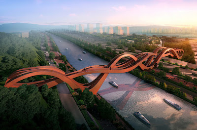
The nominator said: "This monstrosity should need little in the way of comment, but I will specifically draw attention to the way in which what could have been an interesting whimsy has been ruined by someone who can only draw with a super-fat pencil; and the absence of any step-free access, inexcusable in such a major crossing regardless of the local culture".
The judges said: "An awful bridge that has managed to make its grim surroundings look quite attractive by comparison" ... "Great stuff! The materialisation of the napkin sketch of an obvious easy-selling idea. But it is much more than this, it also includes multiple walking routes (none of them accessible for disabled people, but maybe there are no disabled people in Chinese megacities), gigantism, and a bright red colour to piss you off in case you don’t like it."
The nominator said: "My vote goes to: Millenium bridge... in Ourense, Spain. I don't think it needs much explanation, just type 'puente del milenio ourense' in Google and the images will make clear why!"
The judges said: "I will never understand the 'creative mind' that came up with this. It has more than a smack of 'emperor's new clothes' about it" ... "Exquisite in the dictionary sense meaning 'piercing, excruciating, agonising, harrowing, tortuous, tormenting'" ... "It has everything: Absolute lack of respect for the valuable collection of historic bridges in the city, a deck depth that makes any other structural help unnecessary, lots of unnecessary structural help, inclined pylons (verticality is overrated) that lead to clumsy over-designed piers that try to relate to the inclination."
The nominator said: "I have real doubts about this one."
The judges said: "A camel is a horse designed by committee" ... "If you had left a three-year-old playing with a bridge catalogue you would probably have got a more logical result" ... "Interrupted arches, stupid structural scheme combination. Works like this one are the reason why some people hit their foreheads with the palm of their hands when they are told that an architect will be involved in the bridge project they will be working on."
How to vote
You have until midnight (UK time) on Friday 13th October, to vote here.


2 comments:
A very tough decision. I had to disqualify myself from considering the Millennium Bridge as I really enjoyed climbing the wild stairway when I visited there.
"If you can’t make it good, make it big. If you can’t make it big, make it red.”
Let's make it big and red...
Post a Comment