30 January 2019

Upper Orwell Crossings project cancelled

Sometimes, it would be nice to have something positive to write about!

Welcome to what seems to be the final chapter in Suffolk County Council's Upper Orwell Crossings project. This started out in August 2016 as a scheme to build three new bridges across the River Orwell in Ipswich. The original cost estimate was in the region of £97m.


A RIBA-sponsored bridge design competition was held to appoint an architect to work alongside SCC's pre-appointed engineer. This struck me as being:
"one of the worst bridge design competitions to be organised in the UK for quite some time."
It turned out that I was not alone in this view. The main criticism was that the contest was an arranged marriage, with SCC picking an architect rather than an architect-engineer team. What if the architect and engineer just didn't get along? The selection process sought and evaluated designs (a total of five designs for three bridges, per entrant, to be precise), but was ostensibly to pick a designer, not a design. It also had a hefty price component, running the risk that a cheap and poor-quality designer could win against a more expensive but higher-quality designer.

A shortlist was announced in October 2016, several of the entrants either bringing along their own engineer or having in-house engineering expertise:
  • Adamson Associates (Toronto) with William Matthews Associates and Ney and Partners
  • Foster + Partners (London)
  • Knight Architects (High Wycombe)
  • Marc Mimram (Paris)
  • Wilkinson Eyre (London) with FHECOR and EADON Consulting
Foster and Partners were announced as the competition winner in March 2017, with the jury praising the "economic elegance" of the Foster design proposals.


It was clear from the press statements that SCC had picked what they felt would be a globally-recognised design. I drew attention to the RIBA Competitions office's poor track record at actually delivering bridge designs which went on to be built, and commented:
"Ambition should not be scoffed at, but I do wonder whether Ipswich really needs something world-class, or whether they would have been better to set their sights a little lower."
In April 2018, the Architects' Journal reported on an extensive investigation of the design competition, which showed that the exercise was, at best, poorly conducted, and at worst, actively unfair. There were some serious problems with the quality marking, but it was also reported that Foster and Partners revised and resubmitted their price before being awarded the work.

At this stage, I noted:
"I very much doubt that the designs shown at competition stage will be what is built, and in the absence of any meaningful cost or buildability evaluation, it's entirely possible they are beyond what Suffolk County Council can actually afford."
And now this is exactly what has come to pass.

In October 2018, a report was made public from another consultant, Jacobs, employed by SCC to review the project's status and capital cost. According to the latest estimates, the project's budget had increased to somewhere between £122m and £140m. It was apparent that notwithstanding the fuss around the Fosters design, SCC had quietly been developing a secondary design option in the background, a simpler baseline scheme termed by Jacobs the 'Do Minimum' option.

For the main span there was a £10m price difference between the 'Do Minimum' solution (£92m) and the Fosters tree-pier concept (£102m, pictured right). A number of other reasons are cited for cost escalation, none of them amounting to very much other than that the original estimate was too low (figures set before any design was actually undertaken), or that there was a failure to design to the available budget (this may have been impossible anyway).

The problem for SCC is that the project is, in financial terms, highly leveraged (or highly geared). Of the initial cost estimate, only £19m was to be provided by SCC, with the remaining £77m from central government. But central government funds were clearly stated as fixed, so any additional budget has to be provided by SCC. Even if the £122m figure is correct and does not rise further, that leaves SCC having to find £45m - more than double their original commitment, leaving a project they can no longer afford.

This is what also happened in the notorious River Wear Crossing project, eventually killing that scheme, which was also architecturally ambitious, beyond what was reasonable for the site.

Jacobs went on to identify a number of potential cost saving measures, most of them relying on ditching the competition-winning design, and in some options ditching one or both of the two smaller crossings included in the scheme. However, it appears that local politicians have little appetite for the bargain-basement alternatives.


SCC held a cabinet meeting yesterday at which they agreed to cancel the project, although they may still consider whether it makes sense to build only the two smaller bridges.

The papers prepared for SCC's cabinet meeting reveal that SCC have spent some £8.3m getting to this point, the bulk of it (£7.3m) on "external experts and contractors".

This is not quite as bad as the £40m reportedly thrown away on London's Garden Bridge, but you'd hope it's enough for local voters to ask some serious questions of their representatives.

27 January 2019

Johnson Street Bridge lawsuits

How time flies! I first covered Victoria, BC's Johnson Street Bridge some nine years ago, most recently writing about it again in January 2018.

Image courtesy Thedarkempire / Wikipedia

The project was initially controversial for the proposal to replace a 1924 historic heel-trunnion bascule bridge with a modern design. The new design was devised by MMM engineers with Wilkinson Eyre architects, and is a rolling bascule bridge, the largest such structure in Canada. Opposition from heritage groups was eventually defeated and the new bridge was completed and opened to traffic on 1st March 2018.

When I last reported, it was to discuss a dispute between contractor PCL, their client the City of Victoria, and the client's designers MMM. Wilkinson Eyre appeared to have long left the scene. There were also some really quite odd issues with the bridge's steel detailing.

The bridge has been back in the news again due to further legal disputes. These came to light late last year, with PCL filing a lawsuit against Victoria, MMM and design subconsultant Hardesty and Hanover. PCL have alleged that the designers provided a design which was late, incomplete, and contained errors; that the design was unreasonably changed; and they did not receive payments they were entitled to.

Some readers may recall that the contract was primarily traditional in nature, with the client responsible for providing the design, and the contractor building it. An odd feature of the procurement was that the contractor was obliged to value-engineer the client's design (PCL initially employed Hardesty and Hanover to help with this task).

Image courtesy Michal Klajban /Wikipedia

A key problem which seems to have haunted the project throughout its history is that the client's design was incomplete at the time that PCL tendered for the project, which is not normal practice in this kind of contractual arrangement. The contract setup is normally called "traditional" in the UK, or "design-bid-build" in North America, and the latter name indicates that the process is expected to be sequential, with the design complete before bids to build it are invited.

Local journalists suggest that PCL has merely lodged the lawsuit as a placeholder, a negotiating tool with the end aim of walking away from the project without any further liability on either side. This is based on a similar legal manoeuvre that took place in 2015/16.

A report in Focus on Victoria discusses the dispute but also draws attention to the general quality of the completed bridge. According to this report, some steelwork joints were sealed not by welding, but using a sealant material, which is already falling out. More interestingly, the bridge as-built is compared by Focus to the original design images from Wilkinson Eyre, such as the example below.


In the original design, large "ears" containing the bridge counterweights sit alongside the running rails on which the bridge rotates. However, both elements are blended smoothly together to give an organic appearance. With hindsight, it seems fairly clear that those flowing curves would be at best expensive and at worst impossible to fabricate, and likely to fall victim to the promoter's desire for value engineering.

Image courtesy Focus on Victoria

This picture shows what it really looks like, which is quite horrendous. There seems to be have been little thought about how to deliver a smooth curve in the steelwork, or even how to give the impression of one.

There's no manipulation here, either. The second image below shows just how disjointed the main steelwork trusses and counterweight ears actually are, with a physical gap between them on the outside face. To me, it looks quite bizarre.

Image courtesy johnsonstreetbridge.org

There are plenty of images on Google Streetview which show the issues as well.

Make no mistake: this is a remarkable bridge, with an interesting, exciting design. It's unfortunate that nobody was retained on the project with a brief to maintain the quality of the original design vision, and that the procurement process failed to find an acceptable balance between cost-cutting and quality.

Anyone who has worked on a complex landmark bridge project will know it can sometimes be a real battle to ensure an original idea isn't disfigured through messy compromise. Unless the client's commitment is there, it's difficult to resist negative changes. Even with a strong and imaginative client, success comes through all the team members pulling in the same direction, rather than being incentivised to do the opposite.

14 January 2019

Richard La Trobe-Bateman: Part 2. Public Bridges

This is the second part of a two-part post on the bridges of artist/designer Richard La Trobe-Bateman. This time I'm featuring bridges which are publicly accessible (to varying degrees), but there's no hard-and-fast separation so please don't take my categorisation too seriously.

Something I didn't mention last time is that La Trobe-Bateman is the great-great-great-great-grandson of one of the most significant 19th century British engineers, Sir William Fairbairn. Fairbairn's daughter Ann married John Frederick La Trobe-Bateman, who was himself a highly notable engineer, becoming president of the Institution of Civil Engineers, and developing an early proposal for a tunnel across the English Channel. Whether any of this heritage has impacted the artist's path in life, I don't know!

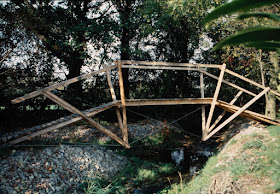
The 14.5m span bridge at the National Pinetum in Bedgebury (1996), pictured below under construction, is in a Forestry Commission woodland (parking charges apply). I believe it's the only one of La Trobe-Bateman's timber bridges in the UK that the public can walk across. It was engineered by Mark Lovell Design Engineers, who have collaborated with the artist on several occasions.

It's not entirely clear from the photograph, but the central part of the bridge is a diamond-shaped truss in timber with steel wires. The upper compression chords continue to form the upper part of triangular frames at each end, which effectively support the diamond section. It's an elegant design which exemplifies the designer's desire for structural clarity, with clear separation of tension and compression elements. It is noticeably less three-dimensional than several of his later designs, consisting of two identical frames, cross-braced in timber for lateral stability.


A timber bridge which can be seen but not crossed can be found at Buscot Park in Oxfordshire. This is a National Trust property, so there is a fee for admission. The bridge consists of a series of three 6m long king-post trusses, built in 2011. Two specialist timber firms claim credit for helping with this bridge on their websites, The Timber Frame Company and WoodenHouse, possibly because the artist's son Will has worked for both firms.


A cable joins the tops of the three trusses and is a feature of how the bridge was installed - it was launched from one side of the lake, and can be rolled back again at any time. The photograph below (© Des Blenkinsopp [cc-by-sa/2.0]) shows the bridge partially retracted.


La Trobe-Bateman's work is both art and engineering; the identification of structurally stable arrangements is central to it, as is the search for economy of materials. Many of his more recent bridges also consider the economy of construction - the way in which they can be built is an important part of the work.


This is partly a reaction to his few encounters with the world of commercial bridge-building. In 1993, he designed a 19m span tied A-frame bridge over the River Ehen near Cleator in Cumbria, which was built using steel structural members (pictured above). This was winched across the river, although that's not something you see often in bridge construction!

The form of this bridge is unusual and (for me) difficult to understand. The photograph on the right, taken before the walkway was installed, perhaps gives a better idea of its form. The bridge consists of a main steel tripod, from which a suspended pyramid supports the walkway. The tripod legs are tied together by diagonal bracing below the bridge deck.

I find this design less appealing than the timber-and-cable bridges. It is clunky and slightly incomprehensible, and the lack of material distinction between tension and compression elements is less visually appealing.

In 1994, La Trobe-Bateman entered a design competition for a new footbridge in Bristol, but was unsuccessful. His proposal was for another tripod type bridge, with deck sections that swung out to either side. The eventual winner was designed by Arup and Eilis O'Connell.

A later steel footbridge at Langport in Somerset (2006) was designed with Mark Lovell Design Engineers. The artist's sketch shows a simply-supported span, a form of underspanned suspension bridge where the upper chord is at handrail level, and the lower element is a tie-bar, with two steel stanchions on each side of the bridge strutting the two main elements apart. The entire bridge was lifted into place by crane.


This is the better-looking of the two completed steel designs, but it still lacks the charm of the wood-and-wire bridges. Again, I think the use of a single material is less visually self-explanatory, and the parapet posts and infill are too solid.


More recent designs deliberately seek methods of hand-assembly and erection, even the 27m long timber arch truss built in 2017 for the Timber Framers Guild conference in Wisconsin, USA (which is available for sale from Areté Structures, for anyone interested).


There are two very interesting accounts online which describe this bridge's construction. A number of volunteers were involved in helping to plan the bridge, including helping to develop the design over a period of time, including completing a 1:5 scale model as a trial. The bridge itself was then assembled by conference attendees, taking 20 hours to erect, and 4 hours to take back down.

This bridge belongs to a family of La Trobe-Bateman structures which spring from pyramids or tetrahedra at each end. Other examples on the artist's website are more of a cable-stayed form. With bridges of this type, horizontal thrust occurs at the foundations, and they must either be anchored into the ground or rely on friction. Built on a building roof, the Timber Framers Guild installation used temporary tie cables to hold the supports together.


At this scale, the necessities of structural engineering make the structure more like a conventional bridge and less like a work of art. The use of both timber and wire becomes more of a challenge, as the lack of stiffness in slender wires would have a more noticeable impact on the structure's performance.

The latest bridge project is the artist's largest, a 32m span cable-stayed bridge planned to be erected at the Burning Man Festival in 2019.


The intention again is for this bridge to be erected by hand avoiding typical construction plant as much as possible. A physical gap will be left at the middle of the bridge, reminiscent of the planned footbridge at Tintagel Castle in Cornwall. There's a nice little video at Tamara Stubbs' website where Richard explains the project.


The economy of materials in many of La Trobe-Bateman's works is key to their visual success. "Real" pedestrian bridge designers and builders would struggle to match it. For the spans involved, wood is a reasonably robust material, but thin steel wires lack stiffness and can only be pre-tensioned to a certain degree. Stiffness drives the use of thicker members on real bridges. Long-term durability is also a problem, as is the need to comply with standards and regulations, especially for parapets. The artist bridges certainly look better because of their minimal (and sometimes absent) parapets.

As a professional bridge designer, these designs feel aspirational to me, indicative of an ideal to strive towards rather than something that I could readily achieve. I also admire a sense of contradiction that several of the designs exhibit: they look at first to be simple, but on further examination seem more complex; or they look at first to be complex, but turn out to be based on simple forms and ideas. For me, they always demand attention, to try and understand how they are formed and how they work.

Further Information:

08 January 2019

Richard La Trobe-Bateman: Part 1. Private Bridges

I've wanted to feature artist and bridge-maker Richard La Trobe-Bateman here for some time. Late last year, I finally got hold of a copy of his "Making Triangles" book, and Richard has also kindly shared several photographs for me to use.

La Trobe-Bateman has been creating art since the late 1960s, initially making wooden furniture. His early chairs were in an arts-and-crafts style, evolving over time into examples with far fewer individual elements. His works also moved away from a rectilinear style towards the increasing use of triangular frames.

As any truss designer knows, this geometry provide stiffness with minimal material and without bending of individual elements. In three dimensions, the triangles naturally became tetrahedra, and in 1987 La Trobe-Bateman made his first bridge.


Pictured above, this "hanging boom" bridge was a short span over a stream, a simple A-frame mast supporting a single crane-like cantilever spar, with the deck suspended from thin galvanised steel wires and the various timber pieces stabilised by a further array of triangulated wires.

Since then, roughly thirty of the artist's bridges have been built and exhibited throughout the UK, and in one or two cases abroad. The use of timber and wire is a common theme, and the structures are often experimental in arrangement, if often inevitably drawing on forms better known from larger bridges.

Many of the bridges are private commissions. Several are variations on a tripod form, with a couple of examples pictured below, a 15m long span passing through a tree (1995), and two 9m span twin bridges (1994), built with various oak, douglas-fir and stainless steel elements. These give the initial impression of something anyone could throw together with a bit of trial and error: beginning with a simple form and adding only one element at a time until the whole assembly is stable.


La Trobe-Bateman's methodology is to develop geometry using smaller scale models, to ensure the form exhibits structural clarity while minimising material, both typically the concerns of bridge engineers. The models also allow the method of construction to be rehearsed, and confirm that any given geometry is, in principle, stable.

A more recent example of the same form was built at Tassajara Monastery in California, a 15m span douglas-fir tripod structure which was first trial-assembled in the studio before being erected on site in 2006 using only a single chain-winch. The construction process was recorded online by Courtney Skott at Flickr, and also in a book by Donald Fortescue, who later documented its rebuilding in 2012.


This design illustrates one way in which these are sculptures as well as footbridges - the structural form is self-contained, simply supported, held together with tie cables like a triangular bowstring truss. So far as I can tell, all these designs avoid imparting any horizontal thrust onto their foundations, they are as stable on a smooth gallery floor as they are on site.

A professional bridge designer might take a different approach, using thrust-bearing foundations to ensure that parts of the frame are stable temporarily before all elements are complete. There are other details which a professional designer might avoid - most notably the lap splices visible on two of the main struts. I think a professional would have made a butt-splice, or a machined lap-splice to minimise eccentricity of loading and reliance solely on the strength of fixings.


This is evidence of an artist's philosophy rather than an engineer's - one of La Trobe-Bateman's stated design principles is to "get closer to the earlier stages in converting trees to useable pieces", and I guess that means avoiding over-engineering.

Several of the bridges also owe a direct and presumably conscious debt to the patent truss bridges of the 19th century. This next example, completed in 2008, is described by La Trobe-Bateman as a 6m span Bollman truss, and does share Wendel Bollman's arrangement of multiple suspension cables each attached near one end of the upper chord (here doubling as the handrail).


Another small bridge borrows (and adapts) the form of Albert Fink's truss, which used overlapping triangular frames below bridge deck level. In La Trobe-Bateman's 10m long 1989 adaptation, the truss struts are continued above deck to support the bridge handrail.


A similar idea was used in 1992 for what the designer refers to as a "bowstring bridge". This was a mere 4m long, in the form of an underspanned suspension bridge (compare for example Maryhill House Footbridge and Roxburgh Viaduct Footbridge as 19th century antecedents). I like the sense in this bridge that the parapet assembly is perched precariously on the central point, as well as the slenderness of the deck.


La Trobe-Bateman describes his work as "art as a byproduct of design". All the bridges are clearly functional, but it's notable that they are generally photographed without people standing upon them, emphasising the sense that these are art objects as well as bridges.

They may be designed to be experienced close at hand, but as an engineer, much of the appeal for me is in seeing them as structural assemblies and considering the relationship between static behaviour, embodied craftsmanship, and aesthetics.

This post is getting very long, so I'll conclude in a second post, covering examples of more publicly accessible bridges.