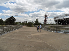
The site of the 2012 London Olympics was massively redeveloped for the event. Alongside the sports stadia and facilities, an extensive path network was built, and a large number of temporary and permanent bridges. During the Olympics itself, many of these bridges were either inaccessible or difficult to reach. Now that the event has long since left town, the Olympic park has been turned into a public park, and it's finally possible to see some of the infrastructure legacy properly.
 The centrepiece bridge in the Olympic park was the winner of a design competition. I first visited it in the Olympic year, when it was temporarily configured as a wide plaza-type bridge, barren from above and ugly from below, largely due to the nature of the temporary decking used.
I won't "explain" the bridge here again in any detail, as you can read all that in my previous post. However, the permanent structure, with the temporary decking removed, is a much more successful bridge than before. It is Z-shaped in plan, with two main bridge decks joined by a secondary walkway (for an utterly bizarre explanation for the layout, see YouTube).
 The original competition visuals from architect Henneghan Peng showed the area carved out into a lush, green basin, with the bridge as a series of shimmering stainless steel elements perched above. Cost, or pragmatism, has done away with most of the greenery, and the landscaped basin is somewhat barren. This highlights the fact that the bridge spans a canal, and that at the lower level, there is no way across. It is therefore not an especially pleasant space, with the main attraction being the shifting reflections to be seen in the bridge decks above.
 Those decks are looking pretty good now. The bridges are steel trusses clad in segmental stainless steel panels. They've been nicely cleaned up since the Olympics, and their segmental nature helps break up the reflections in an interesting way.
The bridge abutments, environmentally friendly gabion banks, are less visually successful, looking cheap and nasty. It would have looked far better if the bridge had emerged direct from the ground rather than from an array of fussy and awkward detailing.
 At the upper level, the bridge still lacks any kind of character. The parapets are detailed appropriately enough, but I am really puzzled by the lighting units which stick out at the base of each post. I can't see any reason why they need to intrude so much into the walkway space.
Overall, I was impressed with this bridge on my revisit. The stainless steel works very well, and my only real criticism is that the harsh landscaping provides a rather bleak setting for the structure.
Further information:


No comments:
Post a Comment