Completed in 1992, the Centenary Bridge was claimed to be the first new crossing of the River Aire in Leeds for over 100 years.
 It was planned and promoted by the Leeds Development Corporation, and engineered by Ove Arup and Partners. The contractor was Kier, with Billington Structures fabricating the steel elements and C.V. Buchan precasting the concrete.
The site was (and is) asymmetrical, with a relatively narrow approach on the north bank of the river, and a wider open space on the south. The resulting design is an asymmetrical cable-stayed footbridge.
The A-frame mast is 18.3m tall, with two reinforced concrete legs supported at their base on bearings. The bridge deck has an 11.8m backspan and 43.3m main span, and is a steel half-through girder bridge, with Vierendeel edge girders formed from closed hollow sections.
 A short article in the Arup Journal describes the bridge but doesn't explain its articulation. For an asymmetrical cable-stayed bridge of this type, there is an out-of-balance thrust in the bridge deck, acting towards the mast from the main span. This can be accommodated at the mast, but in this instance appears to be resisted at the back-span abutment, where the horizontal component of force in the deck is balanced by the force in the back-stays. Net vertical forces must be carried by the foundations.
 The bridge will expand and contract under temperature from the fixed support at the abutments, which is presumably why the concrete mast has bearings at its base. The mast was precast, so a simple support detail at the base may also have been desirable for that reason.
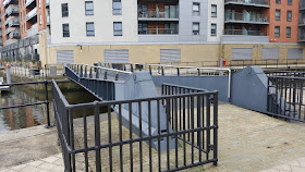
 The bridge girders are not very good looking, and doubly so due to the accumulation of dirt on these and other parts of the bridge.
The parapets use horizontal stainless steel wires, and are an attempt to lighten the general appearance of the bridge.
 As with many urban bridges, there were a number of "love locks" attached to the parapet when I visited, although the local council clearly does not want them on the bridge.
This is not, in my view, a great bridge design. It's easy to see why the designers put the tall mast in the open space on the south bank, but the mast and associated steps and ramps for this end of the bridge dominate this space so that much of the openness has been lost.
The tower is angled at a very slight angle away from the river, and I think a vertical tower would have looked better in this close proximity to surrounding buildings.
Further information:
- Google maps
- River Aire Footbridge (Arup Journal, 1993)
- Structurae
- CanalPlanAC


